Premium WordPress Theme
A how-to guide and helpful informations about
configuration and options in theme.
If you have any questions or problems with this theme please use Envato
Marketplace contact form on our profile.
Muffin group
2013
1
Table of contents:
1. General info & Installation........................................................................................................ 4
1.1 Few words on start ............................................................................................................................. 4
1.2 Package from themeforest ............................................................................................................... 4
1.3 How to install & update it?............................................................................................................... 5
2. Page creation ................................................................................................................................. 6
2.1 Getting started ...................................................................................................................................... 6
2.2 Content Builder .................................................................................................................................... 7
2.3 Page Templates ................................................................................................................................ 29
3. Slider options ............................................................................................................................. 30
3.1 Revolution Slider .............................................................................................................................. 30
3.1.1 Getting demo slider ................................................................................................................. 30
3.1.2 Slider management.................................................................................................................. 30
4. Theme options panel ............................................................................................................... 33
4.1 Getting started ................................................................................................................................... 33
4.1.1 General ......................................................................................................................................... 33
4.1.2 Sidebars ....................................................................................................................................... 35
4.1.3 Blog ................................................................................................................................................ 36
4.1.4 Portfolio ....................................................................................................................................... 37
4.1.5 Sliders ........................................................................................................................................... 38
4.2 Layout ................................................................................................................................................... 40
4.2.1 General ......................................................................................................................................... 40
4.2.2 Header .......................................................................................................................................... 41
4.2.3 Social Icons ................................................................................................................................. 43
4.2.4 Custom CSS ................................................................................................................................. 44
4.3 Colors .................................................................................................................................................... 45
4.3.1 General ......................................................................................................................................... 45
4.3.2 Theme colors ............................................................................................................................. 46
4.3.3 Main menu .................................................................................................................................. 47
4.3.4 Header .......................................................................................................................................... 48
4.3.5 Content ......................................................................................................................................... 49
4.3.6 Footer ........................................................................................................................................... 51
4.3.7 Blog ................................................................................................................................................ 53
4.3.8 Headings ...................................................................................................................................... 54
4.3.9 Shortcodes .................................................................................................................................. 55
4.3.10 Widgets ...................................................................................................................................... 56
4.4 Fonts ...................................................................................................................................................... 57
4.4.1 Font Family ................................................................................................................................. 57
4.4.2 Font Size ...................................................................................................................................... 58
4.5 Translate .............................................................................................................................................. 59
4.5.1 General ......................................................................................................................................... 59
4.5.2 Blog & Portfolio ......................................................................................................................... 60
4.5.3 Contact ......................................................................................................................................... 61
4.5.4 Error 404 ..................................................................................................................................... 62
5. Shortcodes ................................................................................................................................... 63
5.1 Adding shortcodes in content using wp-editor .................................................................... 63
2
5.2 List of available shortcodes & how to use them ................................................................... 63
6. Blog ................................................................................................................................................ 69
7. Portfolio........................................................................................................................................ 70
8. Menu creation ............................................................................................................................ 70
9. Images ........................................................................................................................................... 70
10. SEO ............................................................................................................................................... 71
11. Support & contact with us ................................................................................................... 71
12. XML file with demo content ................................................................................................ 72
13. Advanced theme customization ........................................................................................ 72
13.1 Google Chrome ................................................................................................................................ 73
13.2 Firebug for Firefox ........................................................................................................................ 74
3
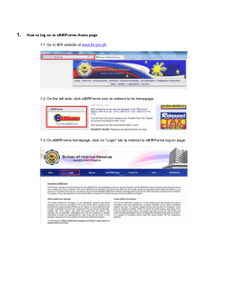
1. General info & Installation
1.1 Few words on start
Our new theme called "Kora" is especially delivered for all those who prefer to manage
all elements on the page. Here you will find things like content builder, shortcodes,
revolution slider or detailed theme options panel. Be sure that with our new theme you
can easily customize whatever you want on your page. Please also note that all this
options are amazingly easy to use.
1.2 Package from themeforest
At first, after purchasing this theme please download the package from Themeforest. All
you need to do that is move your mouse over your login name in right top corner (of
course after you`re logged in Themeforest) and then click Download. Here you will find
all the items that you have purchased. It looks exactly just as the diagram below:
In the next step click the Download button next to Kora theme and save package on
your computer.
In the package you can find things like documentation, license, psd files, zipped file with
theme files and folder with theme files called Kora. Please unpack the whole package
after downloading it from Themeforest.
4
1.3 How to install & update it?
At first please make sure that you have unpacked the whole package shown in the last
point. This is very important! You can complete installation in two different ways:
1. WordPress Theme Manager - plase go to Appearance > Themes > Install
Themes > Upload, select zipped theme folder called "kora.zip" and press Install
Now button. The wordpress will do the rest for you.
2. FTP upload - upload non-zipped theme folder called kora to /wpcontent/themes/ folder in your WordPress installation folder on your server.
In the second part of this guide we have described how to update Kora. Please make
sure that you didn`t make any changes in the files. If you have made changes and you
don`t want to lose them, the best way is to use one of freeware tools for comparing files,
ex. Beyond Compare (we are not the authors of this tool so please don`t ask us how to
use it. Answears to how to use it can be found on their website). After comparing these
files you can upload on server only the files that hasn`t been changed.
If you haven`t changed any theme files, all you need to do is update your version of
theme by downloading the latest package from themeforest, unpacking files and
uploading new files on the server while replacing the old files. Simply overwrite them.
All your data in the database are safe because after updating theme files doesn`t
change anything in the database. Please however always make a backup of your
files & database.
5
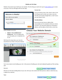
2. Page creation
Creating your own page has been never so easy. To make the first step please go to Pages
> Add new. On first sight everything looks just like in default wordpress. But when you
have a look under Visual/HTML area you will see some Page options.
2.1 Getting started
In first Visual/HTML area you can build your page using all available options in editor.
Beyond the default options we included green button called "Insert shortcode". With this
option you can build any page you want based on shortcodes. All available shortcodes
for this theme has been described in section Shortcodes (section 5).
Please note that you can build page based not only on shortcodes. You can also use
Content Builder (section 2.2).
6
Below the Content Builder you can find some Page Options.
п‚·
Hide the content - this options will hide the content from Wordpress editor. You can
turn this button on or off. If you`re using Content Builder for building content please
turn this button off. If you won`t turn it off, the content from Wordpress editor will
show above the Content Builder items.
п‚·
Layout - you can choose personal layout for each page. There is 3 options to choose:
full width without sidebar, left sidebar or right sidebar.
п‚·
Sidebar - here you can select proper sidebar for this page (of course if in the
previous option you have selected right or left sidebar). You can create your own
sidebars in Appearance > Kora > Getting started > Sidebars.
п‚·
Slider - you can select Muffin offer slider or one of the Revolution Slider's for page.
Please also note that for each page can be different slider. Of course, before select
slider you need to create it with amazing Revolution Slider (section 3).
п‚·
SEO Title - title for page (if you leave this field empty, page will get default settings
from Theme options panel > Getting started > General)
п‚·
SEO Description - description for page (if you leave this field empty, page will get
default settings from Theme options panel > Getting started > General)
п‚·
SEO Keywords - keywords for page (if you leave this field empty, page will get
default settings from Theme options panel > Getting started > General)
After set up all this options on right side you can also choose right Page Template (section
2.3) for this site.
2.2 Content Builder
What about Content Builder? With his help web development is child's play. At first please
choose an item that you need on page.
Afterward select one of the items please click Add item button. After that you will see the
right Item already added below. You can do few things with this added Item.
п‚·
п‚·
п‚·
п‚·
Expand Item to 1/4, 1/3, 1/2, 2/3, 3/4, 1/1 by using "+" button in the Item. The same
way you can shorten this Item using "-" button. Please note that not all Items
working with all sizes.
You can delete Item if you don`t need it by Лџ in right Item corner.
You can edit each Item by click on "pencil" in right bottom corner in the Item.
You can also move any Item by drag & drop.
Please remember that Content Builer is working only with Default template.
7
You can choose one of below items:
a) Accordion
This Item is adding Vertical tabs on page. You can add as many tabs as you need, just type
Title and Content for each tab.
Available sizes: '1/4', '1/3', '1/2', '2/3', '3/4', '1/1'
Attributes: this item similar to Tabs Item doesn`t have attributes like other Items.
Instead of you can add new tabs by clicking "Add tab" and delete them by clicking Лџ.
8
Preview:
9
b) Article box
This Item can create Article box with image and short description.
Available sizes: '1/4', '1/3', '1/2', '2/3', '3/4', '1/1'
Attributes:
п‚·
п‚·
п‚·
п‚·
п‚·
п‚·
Image (image for article box)
Title (title for article box)
Content (content for article box)
Button Text (text for article box button)
Button Link (link for article box button)
Open in new window (choose if you want to open in new window)
10
Preview:
c) Blockquote
This Item is creating Blockquote box on your page.
Available sizes: '1/4', '1/3', '1/2', '2/3', '3/4', '1/1'
11
Attributes:
п‚·
п‚·
п‚·
п‚·
п‚·
Content (text your own content for blockquote Item. Here you can use html tags)
Author (author of this blockquote)
Link title (link title)
Link (link to author's page)
Open in new window (choose if you want to open link in the new window or not)
Preview:
d) Call to action & iframes
This item can create nice Call to action button.
Available sizes: '1/1'
Attributes:
п‚·
п‚·
п‚·
п‚·
Text (text for call to action item. You can use html tags here)
Button title (title for call to action button)
Button link (link for call to action button)
Class (useful when you want to use Fancybox "fancybox" or Video iframe "iframe")
12
Preview:
e) Clients
This item is very useful option for embedding list of clients into page. Please note that you
need first add new clients into Clients > Add New.
Available sizes: '1/1'
Attributes:
п‚· Show pager (choose if you want to show slider arrows or not)
Preview:
f) Code
13
This Item can be used for present code. Also it convert all html tags into html special chars.
Available sizes: '1/4', '1/3', '1/2', '2/3', '3/4', '1/1'
Attributes:
п‚·
Content (add your own code here)
Preview:
g) Column
This Item is creating your own column. Think about what you want to be here and just do
it.
Available sizes: '1/4', '1/3', '1/2', '2/3', '3/4', '1/1'
Attributes:
п‚· Column content (this is the only attribute for this Item, feel free to use here html
tags and shortcodes)
14
Preview:
h) Contact box
This Item is creating contact box. You can set up in this box few ways to contact with you.
Available sizes: '1/4', '1/3', '1/2', '2/3', '3/4', '1/1'
Attributes:
п‚·
п‚·
п‚·
п‚·
п‚·
п‚·
Title (contact box title)
Address (set up your address, html tags are also allowed for this field)
Telephone (telephone number)
Fax (fax number)
Email (email address)
WWW (website url)
15
Preview:
i) Contact form
This Item is creating contact form. It`s easy and takes just few seconds.
Available sizes: '1/4', '1/3', '1/2', '2/3', '3/4', '1/1'
Attributes:
п‚· Title (contact form title)
п‚· Email (email address for contact form, on this email will be send all emails)
Please remember to do not include multiple contact forms on one page!
16
Preview:
j) Content
Adding this item will show Content from Wordpress Editor above Page Options. You can use
it only once time per page. Please also remember to turn off "Show The Content" option.
Available sizes: '1/4', '1/3', '1/2', '2/3', '3/4', '1/1'
Attributes:
п‚· Inner horizontal padding (you can choose if you want left & right padding)
п‚· Margin bottom (set bottom margin in px for your content)
17
k) Divider
This item is creating space between elements. It is also aligning for a single line, boxes
located underneath.
Available sizes: '1/1'
Attributes:
п‚·
п‚·
Divider height (enter the amount of the divider height)
Show line (choose if you want to show horizontal line as a divider)
l) FAQ
With this item you can create own FAQ page.
Available sizes: '1/4', '1/3', '1/2', '2/3', '3/4', '1/1'
Attributes:
п‚·
Add tab (just add your own tabs for FAQ item)
18
Preview:
m) Feature box
With this item you can create great box with image, title and link.
Available sizes: '1/4', '1/3', '1/2', '2/3', '3/4', '1/1'
19
Attributes:
п‚·
п‚·
п‚·
п‚·
п‚·
Image (upload image for feature box)
Text Bar color (choose color for text bar from one of predefined colors)
Title (type title for feature box)
Link (type link for feature box)
Open in new window (choose if you want to open link in new window or not)
Preview:
n) Image
This item is very useful option for embedding images into page.
Available sizes: '1/4', '1/3', '1/2', '2/3', '3/4', '1/1'
Attributes:
п‚·
п‚·
Image (here you can choose your own image)
Alternate text (alt text for image)
20
п‚·
п‚·
п‚·
п‚·
Caption (short text under image)
Zoomed image (here you can choose your image to be opened after click)
Link (if you don`t want to open image after click, you can type your own link for this
image)
Border (choose if you want border on image or not)
o) Latest posts
This item is very useful option to create latest posts item on page.
Available sizes: '1/4', '1/3', '1/2', '2/3', '3/4', '1/1'
Attributes:
п‚·
п‚·
п‚·
п‚·
Title (title for latest posts item)
Category (choose from which category you want to show latest posts)
Count (type how many items you want to show on page)
Show pager (choose if you want latest posts as slider or not)
p) Map
21
This Item will create the Google map. Map item is based on Google Maps API.
Available sizes: '1/4', '1/3', '1/2', '2/3', '3/4', '1/1'
Attributes:
п‚·
п‚·
п‚·
п‚·
Google Maps Lat (type right Lat value for your position)
Google Maps Lng (type right Lng value for your position)
Height (height of the map)
Zoom (zoom of the map)
The map will appear only if Google Maps Lat and Google Maps Lng are filled correctly.
Preview:
r) Offer page
This Item will create great looking Offer page. Offer items you can add in Offer > Add new
section.
Available sizes: '1/1'
Attributes:
п‚·
Order by (choose how you want to order your offer: Date, Menu order or Title)
22
п‚·
Order (choose if you want to order Ascending or Descending)
s) Offer slider
This Item will create great looking Offer slider. Offer items you can add in Offer > Add new
section.
Available sizes: '1/1'
Attributes:
п‚·
п‚·
п‚·
п‚·
п‚·
п‚·
Title (title for Offer slider)
Offer page (choose Offer page)
Link title (title for link)
Order by (choose how you want to order by: Date, Menu order, Title)
Order (choose if you want to order by Ascending or Descending)
Show pager (choose if you want to show your offer as slider or not)
Preview:
23
t) Our team
This Item will create the single Our team profile. Show your team using this item.
Available sizes: '1/4', '1/3', '1/2', '2/3', '3/4', '1/1'
Attributes:
п‚·
п‚·
п‚·
п‚·
п‚·
п‚·
п‚·
Photo (choose photo for one of your our team's profile)
Title (title for one of your our team's profile)
Subtitle (subtitle for one of your our team's profile)
Email (email for one of your our team's profile)
Facebook (facebook link with http:// for one of your our team's profile)
Twitter (twitter link with http:// for one of your our team's profile)
LinkedIn (LinkedIn link with http:// for one of your our team's profile)
You can create as many profiles for your people as you need.
24
Preview:
u) Pricing item
This Item will create amazing Pricing Table.
Available sizes: '1/4', '1/3', '1/2', '2/3', '3/4', '1/1'
Attributes:
п‚·
Title (pricing item title)
25
п‚·
п‚·
п‚·
п‚·
п‚·
п‚·
п‚·
Price (enter your price)
Currency (enter your currency)
Period (enter period for pricing table)
Content (enter item content)
Link title (enter link title, this link title will appear only if this field is filled)
Link (enter link, this link will appear only if this field is filled)
Featured (choose if you want to make this item featured or not)
Preview:
26
v) Tabs
This Item will create Tabs. You can add as many tabs as you want.
Available sizes: '1/4', '1/3', '1/2', '2/3', '3/4', '1/1'
Add your own tabs by clicking "Add tab" button. You can add as many tabs as you need.
Attributes:
п‚·
п‚·
Title (tabs title)
Content (tabs content)
27
Preview:
w) Vimeo
This item is very useful option for embedding Vimeo videos into page.
Available sizes: '1/4', '1/3', '1/2', '2/3', '3/4', '1/1'
Attributes:
п‚· Vimeo video ID - vimeo video`s ID. This value is placed at the end of every vimeo
video after last "/", for example: http://vimeo.com/19819283
п‚· Width - player`s width, 700 is highly recommended for left or right sidebar
template while 950 for a default one.
п‚· Height - video player`s height
28
x) Youtube
This item is very useful option for embedding Youtube videos into page.
Available sizes: '1/4', '1/3', '1/2', '2/3', '3/4', '1/1'
Attributes:
п‚· YouTube video ID - youtube video`s ID. This value is placed at the end of every
video after "v=" parameter, for example:
http://www.youtube.com/watch?v=YE7VzlLtp-4
п‚· width - player`s width, 700 is highly recommended for left or right sidebar
template while 950 for a default one.
п‚· height - video player`s height
2.3 Page Templates
Template has several specially designed Page Templates, which can be used on Pages,
adding them special features.
Archives
This template can automatically create list, that contain Available Pages, Latest Posts,
Archives by Subjects and Archives by Months.
Portfolio
This template let you to add Portfolio for website. You can see these entries in section
Portfolio > Portfolio.
29
3. Slider options
3.1 Revolution Slider
3.1.1 Getting demo slider
In package downloaded from Themeforest you can find slider-demo folder that has
included uploads folder and slider1.txt file. In first step please upload content from
uploads folder to your wp-content/uploads folder. In next step you need to go to
Revolution Slider, click button "Create new slider" and fill below fields:
Slider Title: Slider 1
Slider Alias: slide1
In next step please click "Create Slider" button.
On the list of available sliders, click on slider that you already created and in the bottom
section you will see "Show Export / Import" link. After that you will get field to select file.
You need to choose slider1.txt file in this step and click "Import Slider" button.
3.1.2 Slider management
After pressing the "Create New Slider" button you will reach a form where you are asked
to enter a Slider Title (used for the Slider overview in this backend) and a Slider Alias (a
slug that is used to implement the Slider in your WP later, so keep it simple with no
spaces and special chars).
30
You are also prompted to enter the Sliders Basic Settings, a Slider Title (for you to
remember the Slider by) and a Slider Alias (please do not use special characters or
spaces here, this defines the shortcode for you to use in your content).
The options in the boxes on the right side (General Settings, Position, Appearance,
Navigation, Thumbnails) have helping Tooltips on mouseover so they are not explained
here.
The Slider Type can be fixed (not responsive, fix dimensions), responsive (changes
depending on the size of its max. sizes given later in relation to the screen size) or
fullwidth (always 100% in width of the screen size, but height keeping the aspect ratio).
The Sizes section is needed to fit the slider in all screen sizes needed. The height of the
slider will always be calculated to keep the aspect ratio from the max width and height
given in the Slider Size line.
The next step is creating/editing slides. You get there by just clicking on "Edit Slides" in
the Slider Form window.
Just press "New Slide" and the native WP Media Upload dialog window will appear.
Choose or Upload the slide's background image, choose "Full Size" and then "Insert Into
Post" (all like you are used to it in your WP editor). You can always click on the pic to
change it.
Use the arrow handles on the right side to change the slides position in the slider (top to
bottom = first to last slide to be shown) or delete it with the "Delete" button.
The "Edit Slide" leads you to the next chapter "Slide".
In the "Edit Slide" view you see the heart of our plugin. The drag&drop Caption editor.
But first please note that you have another chance here to change the background image
with the "Change Image" button.
To create a Layer (Caption, Image or Video) press the button "Add Layer" or "Add Layer:
Image". In case of a text layer a basic layer will be created you can use the "Text" field in
the Layer Params to change the caption on it. The "Style" selectbox shows some basic
styles (CSS classes) you can use to style the caption (you can always add own CSS classes
to this field or edit the existing ones via the "Edit CSS File").
In case of an Image Layer you will see the native WP Media Uploader again. In case of a
Video Layer you will prompted to a custom Video selection wizard.
You now can move the Layers around via drag&drop or type in the x and y coordinate in
the corresponding fields.
The "Layers Sorting" drag&drop list determines the Layers' z-index. This list specifies
the stack order of an element.
31
An element with greater stack order is always in front of an element with a lower stack
order.
Please also note that slider is a plugin and whole documentation for this item you
can find in documentation/revolution-slider-documentation folder in package
downloaded from themeforest.
Remember: please set up chmod on 777 on below folders to show slider
thumbnails and for possibility to edit CSS styles for slider in admin panel.
wp-content/plugins/revslider/cache
wp-content/plugins/revslider/rs-plugin/css
NOTE! In default Revolution Slider version included into theme you will get all our
styles for plugin. After update plugin to newer version, please do not forget to copy
slider styles from /revolution-slider-demo/captions.css (this folder is included into TF
package) to /wp-content/plugins/revslider/rs-plugin/css/captions.css
32
4. Theme options panel
Theme options panel has been especially created to make your work faster and easier.
Using it is very easy and in just a few minutes you can change a lot of things on your
page.
4.1 Getting started
4.1.1 General
In this section you can set up some general options for your site. You can find here
things like Google Analytics, Responsive version, etc. Please check below options available
in this section:
п‚·
п‚·
п‚·
п‚·
п‚·
Responsive - choose if you want to use responsive version or not.
Use built-in SEO fields - if you are using external SEO plugin you can easily turn
off built-in SEO option.
Meta Description - this is meta description for homepage but it`s also default
description for each page added in Pages section.
Meta Keywords - this is meta keywords for homepage but it`s also default
keywords for each page added in Pages section.
Google Analytics - paste your Google Analytics code to track your site.
33
34
4.1.2 Sidebars
This is default option for pages and posts. Here you can set whether your post or page
should have full width or maybe include a sidebar (left or right). For example when you
choose Left sidebar each of your pages or post that you will create will have left sidebar.
Of course, this is only default option and while creating page or post you can set
up your own layout.
You can also manage your Sidebars here. You can add new and delete existing one.
Please always remember to click "Save Changes" button. Without that you will lose all
your changes.
35
4.1.3 Blog
Here you can find some options for blog page. This is of course a default option for new
pages. You have got the following options for blog:
п‚· Posts per page - you can select how many posts should be on page.
п‚· Show categories - this option will show categories on posts list and single post
when it is on.
п‚· Show comments - this option will show comments number on posts list and
single post when it is on.
п‚· Show date - this option will show date on posts list and single post when it is on.
п‚· Show tags - this option will show tags on posts list and single post when it is on.
п‚· Social network sharing - this option will show social network sharing on single
post when it is on.
36
п‚· Read more - here you can set up your own text for read more button. When input
is empty the text will not be show.
п‚· All pages in pagination- here you can choose if you want to show all of the pages
insted of a short list of the pages near the current page.
All of this options except Posts per page and Read more can be changed for each post.
Please always remember to click "Save Changes" button. Without that you will lose all
your changes.
4.1.4 Portfolio
37
This option will certainly be very helpful in creating your portfolio page. Here you can set
the following options:
п‚·
п‚·
п‚·
п‚·
п‚·
п‚·
п‚·
Posts per page - this is the number of portfolio posts per page.
Layout - you can choose what layout will be the best for your portfolio (one, two,
three or four colums)
Portfolio page - here you can select the right page for portfolio from list of all
created pages. You need to choose a page for that because the theme applies info
such a layout, sidebar and link to page in breadcrumbs.
Single item slug - this is a link to single item. After changing that option please go to
"Settings > Permalinks" and click "Save changes" button.
Order by - you can select what should be used to sort your portfolio.
Order - you can choose how your portfolio should be ordered (ascending or
descending).
jQuery filtering - you can choose if you want to filter portfolio items using jquery
plugin to make your portfolio look much better.
Please always remember to click "Save Changes" button. Without that you will lose all
your changes.
4.1.5 Sliders
38
This option will certainly be very helpful in creating slider offer on page. Here you can set
the following options:
п‚·
п‚·
п‚·
п‚·
п‚·
Latest posts - Timeout - time in miliseconds between slides transitions for Latest
posts item.
What we offer - Timeout - time in miliseconds between slides transitions for Offer
slider item.
What we offer - Visible items - number of items to show for Offer slider item.
Clients - Timeout - time in miliseconds between slides transitions for Clients item.
Clients - Visible items - number of items to show for Clients item.
Please always remember to click "Save Changes" button. Without that you will lose all
your changes.
39
4.2 Layout
In this section you can set up some layout options such as social icons or logo.
4.2.1 General
40
This section is created for header. Here you can set up some options like:
п‚·
п‚·
п‚·
п‚·
п‚·
Layout - choose if you want boxed or full width layout
Body Overlay - choose body overlay for boxed version of page
Body Background image - choose image for background when page is boxed
Body Background image position - choose position for your background image
Content overlay - choose overlay for content
Please always remember to click "Save Changes" button. Without that you will lose all
your changes.
4.2.2 Header
41
Here you can set up some options for logos, header and much more. Below we will
describe all of them.
п‚· Sticky Header - choose if you want your header to be sticky or not
п‚· Custom logo - choose your custom logo image
п‚· Retina logo - choose your retina logo image (should be 2x larger than Custom
Logo)
п‚· Custom logo width - width used for Retina logo (type width that your custom
logo have in original)
п‚· Custom logo height - height used for Retina logo (type height that your custom
logo have in original)
п‚· Custom favicon - choose your custom favicon image
п‚· Top Bar text - your own text for top bar
п‚· Phone number - your phone number
п‚· Email address - your email address
Please always remember to click "Save Changes" button. Without that you will lose all
your changes.
42
4.2.3 Social Icons
Here you can set up some options for social icons. Below we will describe all of them.
п‚·
п‚·
п‚·
п‚·
п‚·
п‚·
Facebook - link to your facebook profile
Google + - link to your Google + profile
Twitter - link to your twitter profile
Vimeo - link to your vimeo profile
YouTube - link to your youtube profile
Flickr - link to your flickr profile
43
п‚· LinkedIn - link to your LinkedIn profile
п‚· Pinterest - link to your Pinterest profile
п‚· Dribbble - link to your Dribbble profile
If you leave empty field for social icons like facebook, twitter etc. the icons will be not
shown on the page.
Please always remember to click "Save Changes" button. Without that you will lose all
your changes.
4.2.4 Custom CSS
Here you can find only one field called "Custom CSS". You can paste here your own css
code for your page. Of a this field you don`t need to make any changes in css files.
Please always remember to click "Save Changes" button. Without that you will lose all
your changes.
44
4.3 Colors
This is probably the most powerful options section in theme options panel. Here you can
set up any color for each part of your page. Just check how many options you can set up
in our color section.
4.3.1 General
Only three options are available in this section.
п‚· Theme skin - here you can choose one of the predefined styles or you can set
your own colors. Please remeber that color options can be used only with the
Custom Skin.
п‚· Body background - choose color for your background
п‚· Content background - choose background color for content
45
Please always remember to click "Save Changes" button. Without that you will lose all
your changes.
4.3.2 Theme colors
In this section you can set up colors for items like Feature box, latest posts, etc.
п‚·
п‚·
п‚·
п‚·
Theme color 1
Theme color 2
Theme color 3
Theme color 4
Please always remember to click "Save Changes" button. Without that you will lose all
your changes.
46
4.3.3 Main menu
п‚· Menu Link color - color for links in menu
п‚· Hover Menu Link background - background color for links in menu on hover
(this is also color for background on hover when there is no submenu)
п‚· Hover Menu Link color - hover color for links in menu (this is also color for
hover when there is no submenu)
п‚· Submenu background - background color for submenu
п‚· Submenu Link color - link color for submenu
п‚· Hover Submenu Link background - background color for submenu on hover
п‚· Hover Submenu Link color - link color for submenu on hover
Please always remember to click "Save Changes" button. Without that you will lose all
your changes.
47
4.3.4 Header
п‚·
п‚·
п‚·
п‚·
п‚·
п‚·
п‚·
п‚·
п‚·
п‚·
Top bar background - background color for top bar
Top bar text color - text color for top bar
Phone & Email Icons color - color for phone & email icons
Phone & Email color - color for phone number and email on the top bar
Social Icon color - color for social icons
Hover Social Icon color - color for social icons on hover
Title area background - background color for title area (on subpages)
Title Area Title color - title color for title area
Title Area Link color - link color for title area
Title Area Arrow color - arrow color for title area
48
Please always remember to click "Save Changes" button. Without that you will lose all
your changes.
4.3.5 Content
п‚·
п‚·
п‚·
п‚·
п‚·
Text color - text color for content
Link color - text color for links
Hoover Link color - hover color for links
Bold Note text color - text color for bold note
Green Note text color - text color for green note
49
п‚·
п‚·
п‚·
п‚·
п‚·
п‚·
Grey Note text color - text color for grey note, ex. post date, post category, etc.
Border color - color for border
Button background - background color for button
Button text color - text color for buttons
Button text shadow - text shadow color for button
Button arrow color - arrow color for button
Please always remember to click "Save Changes" button. Without that you will lose all
your changes.
50
4.3.6 Footer
51
п‚·
п‚·
п‚·
п‚·
п‚·
п‚·
п‚·
п‚·
п‚·
п‚·
п‚·
п‚·
п‚·
п‚·
Footer background- choose background color for footer
Footer border top color - border top color for footer
Footer heading color - heading color for footer
Footer text color - text color for footer
Footer Link color - link color for footer
Hoover Footer Link color - link color for footer on hover
Active Footer Menu Link color - link color for menu in footer on active
Bold Note text color - text color for bold note in footer
Grey Note text color - text color for grey note
Borders & frames - borders and frames colors
Footer social icon color - color for social icons in footer
Hover Footer Social Icon color - color for social icons in footer on hover
Go to top icon background - background color for "back to top" icon
Hover Go to top icon background - background color for "back to top" icon on
hover
Please always remember to click "Save Changes" button. Without that you will lose all
your changes.
52
4.3.7 Blog
п‚·
п‚·
п‚·
п‚·
п‚·
Calendar icon color - icon color for calendar on blog
Day & Month text color - text color for day & month on blog
Year text color - text color for year on blog
Post background - background color for posts on blog
Image border - border color for image on blog
Please always remember to click "Save Changes" button. Without that you will lose all
your changes.
53
4.3.8 Headings
п‚·
п‚·
п‚·
п‚·
п‚·
п‚·
п‚·
Heading H1 color - text color for h1 (Subpages header title font color)
Heading H2 color - text color for h2
Heading H3 color - text color for h3
Heading H4 color - text color for h4
Heading H5 color - text color for h5
Heading H6 color - text color for h6
Heading highlight color - highlighted color for heading if they are wrapped into
"span" tag.
Please always remember to click "Save Changes" button. Without that you will lose all
your changes.
54
4.3.9 Shortcodes
п‚· Accordion & Tabs Content background - background color for accordions and
tabs
п‚· Accordion & Tabs Title color- title color for accordions and tabs
п‚· Active Tab Title color- title color for accordions and tabs when active
п‚· Call To Action Text color - text color for call to action item
п‚· Call To Action Highlight color - highlight color for call to action item
55
п‚·
п‚·
п‚·
п‚·
п‚·
п‚·
Call To Action Button text color - button text color for call to action item
Feature Box Title color - title color for feature box item
Our Team Title color - title color for our team item
Our Team Title background - title background color for our team item
Our Team Subtitle color - subtitle color for our team item
Our Team Subtitle background - subtitle background color for our team item
Please always remember to click "Save Changes" button. Without that you will lose all
your changes.
4.3.10 Widgets
п‚· Muffin Menu link color - link color for muffin menu
п‚· Active Muffin Menu link color - link color for muffin menu when active
п‚· Active Muffin Menu arrow color - arrow color when muffin menu is active
56
Please always remember to click "Save Changes" button. Without that you will lose all
your changes.
4.4 Fonts
In this section you can set up fonts for your website. We divided this section on four
blocks what you can see below.
4.4.1 Font Family
п‚·
п‚·
п‚·
п‚·
Content Font - this font will be used for all theme texts except headings and menu
Main Menu Font - this font will be used for header menu
Headings Font - this font will be used for all headings
Google Font Subset - you can specify which subsets should be downloaded.
Multiple subsets should be separated with coma (,)
You can choose your own font from a palette of over 600 fonts.
57
4.4.2 Font Size
п‚·
п‚·
п‚·
п‚·
п‚·
п‚·
п‚·
п‚·
Content - this font size will be used for all theme texts
Main menu - this font will be used for top menu only
Heading H1 - this font will be used for h1 headings
Heading H2 - this font will be used for h2 headings
Heading H3 - this font will be used for h3 headings
Heading H4 - this font will be used for h4 headings
Heading H5 - this font will be used for h5 headings
Heading H6 - this font will be used for h6 headings
You can select the font size of the range 1-70.
58
4.5 Translate
Translating the most important sections on the page has never been so easy.
4.5.1 General
It depends how you want translate your theme. If you don`t want to translate using .mo and
.po files you can do it easily in this section.
п‚·
п‚·
п‚·
Enable Translate - you can turn it off if you want to use .mo/.po files for more
complex translation.
Search Placeholder - here you can set up placeholder text for Header and Widget
Search
Home - here you can set up breadcrumbs text
59
4.5.2 Blog & Portfolio
This is area where you can set up some texts for your portfolio and blog page.
п‚·
п‚·
п‚·
п‚·
п‚·
Next page - text available on blog & portfolio page
Previous page - text available on blog & portfolio page
Select category - text available on portfolio page
All - text available on portfolio page
Category - text available on blog & single portfolio page
60
п‚·
п‚·
п‚·
п‚·
п‚·
п‚·
п‚·
Comments - text available on blog page
Project Description - text available on single portfolio page
Client - text available on single portfolio page
Date - text available on single portfolio page
Project URL - text available on single portfolio page
Visit online - text available on single portfolio page
Back to list - text available on single portfolio page
4.5.3 Contact
Translate the most important things in Contact.
п‚·
п‚·
п‚·
п‚·
п‚·
п‚·
Your name - translate "Your name" in contact form
Your e-mail - translate "Your e-mail" in contact form
Subject - translate "Subject" in contact form
Send message - translate "Send message" in contact form
Success message - translate "Success message" in contact form
Error message - translate "Error message" in contact form
61
4.5.4 Error 404
Now your Error 404 page is 100% configurable. You can set up here below options:
п‚·
п‚·
п‚·
п‚·
Title - this is title for error 404 page
Subtitle - this is subtitle for error 404 page
Text - text message for error 404 page
Button - this is text for button on error 404 page
For each fields you can set up your own text.
62
5. Shortcodes
As you know, shortcodes are really useful in creating pages, and they accelerate your
work. That`s the main reason why have created them. Below you`ll learn how to use
them in the "Kora" theme. There is a lot of them and they are easy to use.
5.1 Adding shortcodes in content using wp-editor
You can use shortcodes directly in WP editor. Just click on green circle button with plus
inside. After that you`ll see whole list of shortcodes. After select right shortcode and click
"Insert", the shortcode will be inserted into editor.
5.2 List of available shortcodes & how to use them
1) Buttons - as name indicates, these are the buttons to use on pages. Attributes for
buttons are:
п‚·
п‚·
п‚·
п‚·
п‚·
п‚·
link (link to other page)
title (title for button)
target (optional target for link, ex. "_blank")
size (optional size of button - "normal" is default, you can also choose "small" or
"large")
color (color for text - as in background color you can use name of color, ex. "white"
or hex ex."#FFFFFF")
class – this option is useful when you want to use Fancybox (fancybox) or Video
Iframe (iframe)
Below you can see the example of buttons shortcode:
[button link="http://muffingroup.com" target="_blank" title="Muffin group"
size="large" color="orange" class="iframe"]
63
Preview:
For more info and demo please go to buttons shortcode demo
64
2) Divider - This item is creating space between elements. It is also aligning for a
single line, boxes located underneath.
Divider shortcode has got 2 attributes:
п‚·
п‚·
height - enter the amount of the divider height (in px)
line - type 1 if you want to show line, 0 if you don`t want
Example of this shortcode below:
[divider height="30" line="1"]
For more info and demo please go to divider shortcode demo
3) Ico - this is a very useful option for embedding icons into page. This option has got just
one atrribute:
п‚·
type (type of icon)
Below you can see some examples of this shortcode:
[ico type="ico-file"]
[ico type="ico-copy"]
For more info and demo please go to ico shortcode demo
4) Image - this is a very useful option for embedding images into page. This option has got
a long list of available atrributes:
п‚·
п‚·
п‚·
п‚·
п‚·
п‚·
п‚·
src (url to image)
align (optional alignment for image) - available values: none (default), left,
right,center
caption (optional) - text available under the image
link (optional) - link for larger image or other page
link_type (optional) - type of link can be choosen from 2 values available:
target (optional, works only with "details" link_type) - link target, available value:
"_blank" (open in new window)
alt (optional) - alternative text for image
Below you can see some examples of this shortcode:
65
[image src="" link="" align="left" caption="Align left with caption and
lightbox"]
[image src="" link="" link_type="details" target="_blank" align="right"
caption="Align right with caption <br /> and link to details <br /> open in
new window"]
[image src="" align="center"]
For more info and demo please go to image shortcode demo
5) Lists - great tool when you want to present something within the list. We prepared 11
types of lists. Below you can check all of them:
Unordered bullet list
<ul class="list">
<li>List item 1</li>
<li>List item 2</li>
</ul>
Ordered list
<ol class="list">
<li>List item 1</li>
<li>List item 2</li>
</ol>
Roman ordered list
<ol class="list list_roman">
<li>List item 1</li>
<li>List item 2</li>
</ol>
66
Alpha ordered list
<ol class="list list_alpha">
<li>List item 1</li>
<li>List item 2</li>
</ol>
Unordered tick list
<ul class="list list_tick">
<li>List item 1</li>
<li>List item 2</li>
</ul>
Unordered info list
<ul class="list list_info">
<li>List item 1</li>
<li>List item 2</li>
</ul>
Unordered warning list
<ul class="list list_warning">
<li>List item 1</li>
<li>List item 2</li>
</ul>
Unordered plus list
<ul class="list list_plus">
<li>List item 1</li>
<li>List item 2</li>
</ul>
67
Unordered minus list
<ul class="list list_minus">
<li>List item 1</li>
<li>List item 2</li>
</ul>
Unordered arrow list
<ul class="list list_arrow">
<li>List item 1</li>
<li>List item 2</li>
</ul>
Unordered help list
<ul class="list list_help">
<li>List item 1</li>
<li>List item 2</li>
</ul>
As you can see, all of these lists have only a different kind of class. So if you want to change
type of the list, you can easily do so by just changing the name of class..
For more info and demo please go to lists shortcode demo
6) Vimeo - this shortcode is for embadding vimeo videos on your page.
Vimeo video shortcode has got 3 attributes:
п‚· video - vimeo video`s ID. This value is placed at the end of every vimeo video after
last "/", for example: http://vimeo.com/19819283
п‚· width - player`s width, 700 is highly recommended for left or right sidebar
template while 950 for a default one.
п‚· height - video player`s height
Example of this shortcode below:
68
[vimeo video="1084537" width="700" height="400"]
For more info and demo please go to video shortcode demo
7) Youtube - this shortcode is for embadding youtube videos on your page.
Youtube video shortcode have got 3 attributes:
п‚· video - youtube video`s ID. This value is placed at the end of every video after "v="
parameter, for example: http://www.youtube.com/watch?v=YE7VzlLtp-4
п‚· width - player`s width, 700 is highly recommended for left or right sidebar
template while 950 for a default one.
п‚· height - video player`s height
Example of this shortcode below:
[youtube video="YE7VzlLtp-4" width="700" height="420"]
For more info and demo please go to video shortcode demo
6. Blog
To create a blog please create a new page Pages > Add New and set up the title eg. Blog. In
field Template leave default option on Default Template. In bottom section you will find Page
options such as Layout and Sidebar. As you probably have guessed, you can choose whether
your blog should be on full width or whether you want it with the sidebar (left or right). If
you want blog with the sidebar you should also select the right sidebar for your page.
You can also add video for each post. In section Post option, uder the Visual/HTML default
editor you have some options to set. In this section you can set up Vimeo or Youtube video.
At the end please click Publish button on the right.
In the next step please go to Settings > Reading > Front page displays > A static page > Posts
page, select page that you have already created and click Save changes.
We have created some features specifically for bloggers. You will find them in Theme
options panel > Getting started > Blog. These options are set on default for each new post.
Full description of options for blog can be found in section Theme Options (section 4.1.3)
Adding new posts works similar to standard WordPress Posts > Add New. Posts will be
displayed on the already created page.
Images for posts we can add using featured image.
69
For more info about post creation please go to http://en.support.wordpress.com/posts/.
You can also check the movie about how to create a post
http://www.youtube.com/watch?v=Sa4uimrgNz8
7. Portfolio
To create a portfolio please start by creating a new page Pages > Add New and setting up
the title eg. Portfolio. In field Template set the option Portfolio template. In the bottom
section you also have Page options such as Layout and Sidebar. As you have probably
guessed, you can select whether your portfolio should be in full width or whether it should
be with a sidebar (left or right). If you decide on the portfolio with a sidebar you should also
select the right sidebar for your page.
In Portfolio section you can also add videos from Vimeo or Youtube for each portfolio item.
Please don`t forget set up featured image for portfolio item when you are adding video.
We have created some options for Portfolio page. You can find them in Theme options panel >
Getting started > Portfolio. More info about these options can be found in Theme options
panel (section 4.1.4).
Porfolio items are working just like typical post. To add a new portfolio please go to
Portfolio > Add new. As you can see you choose similiar options as for a blog.
Additionally, in the bottom section of the page you have Page options. Here you can
choose whether you want a full width portfolio or the one with a sidebar (left or right).
When you choose the option with a sidebar please don`t forget to select the right
sidebar for this page.
You can also type Excerpt and select Featured image. After that please just click Publish
button.
8. Menu creation
Menu creation works as in default Wordpress.
To add your own menus go to Appearance > Menus, type Name for your menu and click
Create Menu. In next step, in section Theme Locations for position Main menu you need to
choose a menu that you’ve just created.
Now you can add Pages, Posts and Custom Links from blocks located on the left. At the end
you need to save it by clicking on Save Menu.
For more info about the menu creation please go to
http://en.support.wordpress.com/menus
9. Images
For this theme we used some images & icons available on the web.
70
Vectors in illustrations has been used from http://www.pixeden.com/
Some images has been also used from http://www.flickr.com/photos/markjsebastian/
& http://www.premiumpixels.com/
Blog images:
http://www.flickr.com/photos/76029035@N02/
Portfolio images:
http://www.flickr.com/photos/58842866@N08/
Background images:
http://www.sxc.hu/photo/902183
http://www.sxc.hu/photo/1340045
http://www.sxc.hu/browse.phtml?f=view&id=1120393
10. SEO
In the era of what is happening in the search engines (especially Google) we
implemented SEO option in our theme. We hope this will be very helpful for all of you.
To set up general options for SEO please go to Theme options panel > Getting started >
General . You can set up here things like Meta Description or Meta Keywords for
homepage (this is also default option for each new page).
If you are using external SEO plugin you can easily turn it off.
Of course you can also set up options like Title, Meta Description and Meta Keywords for
each page in this theme. You can do it in Pages > Add page > Page options.
In section Page Options you can find fields like SEO Title, SEO Description and SEO
Keywords. If you fill these fields, the page will adopt this values. If you leave this fields
empty, the page will adopt default values that are in Theme options panel > Getting started
> General.
11. Support & contact with us
You can contact us in few ways. It depends on what you exactly need.
п‚· If you have got a questions about theme, please place your question on forum
http://forum.muffingroup.com/kora . Please note that we won`t answear
support question in comments or emails - we prefer to provide you with support
on forum because your question can be helpful to other customers.
п‚· Via comments you can send only presale questions or comment that is not related
to support.
п‚· If you have a really big problem and really need to give us access to your
account (that is personal and can only be used by support) you can contact us by
71
using contact form on our profile`s page on Themeforest
http://themeforest.net/user/muffingroup - in right bottom section of page.
There is no other way contact with us. So please don`t contact us by sending message
on youtube, facebook or twitter - because it`s really difficult for us to control, your
question could be lost in these communication channels.
12. XML file with demo content
To download the XML file with demo content please at first go to
page: http://themes.muffingroup.com/xmls/
In next step please select a product for which you need xml file (in this case please
choose Kora). Please also paste your themeforest username and purchase code.
Afterwards simply click "Download" and your file should start downloading.
When you get this file onto your computer, you can import it into your wordpress
(please import this file only after installing Kora theme). This video
(http://www.youtube.com/watch?v=0fTHYWEGhAc) will show you how to import this
file properly.
13. Advanced theme customization
Sometimes there is a moment when you want to change something on your site that is
not available in theme options panel. Something like: font size, color, margin or any
other customization. You don`t have to ask us about all these things and wait for our
response ever again. You can succeed in doing it on your own.
72
13.1 Google Chrome
To do it you can use two best tools available for free in your web browser. If you`re
using Google Chrome you can inspect element that you need to change by "Inspect
element". To do it just hover mouse on element and click "Inspect element". After that
you`ll see something like on screen below:
As you can see on the image, on the left side there is a list of styles used for each class/id.
If you want to change something, you can edit it on the screen and see how the elements
look like. If everything is good and you want to make the same changes on your site
please copy right styles from box of right side, for example:
#weekly-features .inner-border {
height: 80px;
padding: 20px;
}
and paste this code into: Theme options > Styles > Custom CSS code. If you want to paste
this code instead of Custom CSS code you can do it in custom.css file. The result will be
identical. It`s up to you to decide on which way to use.
73
13.2 Firebug for Firefox
Apart from Google Chrome, we also suggest to use Firebug for Firefox. In contrast to
Google Chrome, Firebug must be installed at first before you can use it. To do so please
click Firefox in the left top corner > Add-ons and then search for Firebug and install it.
When you get it into your browser you can use it the same way as with Google Chrome
but instead of clicking "Inspect element" please click "Inspect element with Firebug". On
the screen below you can see that it will look very similar to Inspect element in Google
Chrome.
As you can see on image, on the left side there is a list of styles used for each class/id. If
you want to change anything you can edit it on the screen and check what elements look
like. If everything is good and you want to make the same changes on your site please
copy right styles from box of right side, for example:
#weekly-features .inner-border {
height: 80px;
padding: 20px;
}
74
and paste this code into: Theme options > Styles > Custom CSS code. If you want to paste
this code instead of Custom CSS code you can do it in style.css file. The result will be
identical. It`s up to you to decide on which way to use.
As you can see, it`s not difficult to use it and with the support of this tool you can save a
lot of time, so we encourage you to try to do it as described and enjoy your new skills.
75
© Copyright 2026 Paperzz