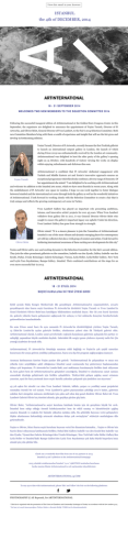
View thi s email in your browser
ISTANBUL
the 30TH of APRIL, 2014
A N E W V ISUAL I D E NTIT Y BY B E R KUTAY G ÜN E L AN D O R ÇUN B İR İ C İK
'A n exc e ss in mo der at ion'
A N E W W E B S ITE FO R AR TINTE R N ATIO N A L H A S B E E N L AU N C H E D BY B E R KUTAY G ÜN E L
A N D O R Ç U N B İR İ C İ K , TH E G R A PH I C D E S IG N E R S B E H IN D TH E V IS UAL I D E NTIT Y O F TH IS
Y E A R ' S E D ITIO N .
As differentiation disappears between the various medium in design practice, and the designer’s job becomes
increasingly perceived as the generation and processing of information rather than “designing”, Berkutay and Orçun
believe that a contemporary designer should be able to work in different media and cater for different areas of
interest. Over their 6-year collaboration they have worked with numerous clients, ranging from multi-national
companies to small indie enterprises, festivals, galleries and artists. The duo uses an array of media, from graphic
design to video production, and photography to digital design. Berkutay and Orçun also work as artists in their own
right, often focusing on the temporal aspect of our relationship with an image/art work, the representation of reality
in media and the construction of narratives in manipulated environments.
In their new visual identity for ArtInternational, the bright colours represent the fair’s energy and ambition while
the distinctive logo retains a calm contrast with its environment. The designers like to call it ‘an excess in
moderation’, where different elements of the design come together in a marked but subtle manner.
The designers have come up with a ‘nomadic’ logo which attaches itself to, or hides in, different backgrounds,
thereby generating an identity not by direct representation but by frequency and ambiguity. The nature of an art fair
– gathering artists, galleries, institutions and other actors from the art scene under one roof – meets with the need
for a graphic identity that does not seek to impose its own context, yet avoids superficiality.
The chaos and diversity of the city of Istanbul was another departure point for the design process of
ArtInternational’s visual identity. Rather than using it as a main theme, Berkutay and Orçun adopted this rich
element for the background. This approach will be seen mostly in the outdoor applications of the identity, presenting
itself almost as a 'null identity' with the aim of creating a breathing space amidst the complex visual language of the
city.
In a time in which web users stay on a page for an average of 10 seconds, the design of the website comes from a
single priority: accessibility. The landing page with easy access buttons aims at providing a practical solution for
users, while the open menu and the simple layout of the website are designed to give access to the information
needed without the visitor becoming lost in too many links.
Visit the new website at www.artinternational14.com
BERKUTAY GÜNEL VE ORÇUN BİRİCİK'İN TASARIMIYL A YENİ BİR GÖRSEL KİMLİK
'Ölçülü ölçüsüzlük'
BU Y ILK I AR TINTE R N ATIO N A L' IN GÖ R S E L K İ M LİĞİN İN YA R ATI C IL AR I B E R KUTAY G ÜN E L
V E O R ÇU N B İR İ C İ K ’ İN TA SA R L A D IĞ I Y E N İ W E B S İTE S İ YAY IN DA !
Tasarım pratiğinde medyalar arası sınırların kaybolmaya başladığı ve tasarımcının görevinin artık “tasarlamak”tan
çok bilginin üretimi ve işlenmesine dönüştüğü çağımızda Berkutay Günel ve Orçun Biricik günümüz
tasarımcılarının, farklı ilgi alanlarına hitap eden farklı medyalarda çalışabilmesi gerektiğine inanıyorlar. 6 yıllık
işbirlikleri süresince çok uluslu şirketlerden, daha küçük, bağımsız girişimlere, festivaller, galeriler ve sanatçılarla,
sayısız müşteriyle çalıştılar. İkili, grafik tasarımdan videoya, fotoğraftan dijital tasarıma son derece geniş bir medya
yelpazesinde üretim gerçekleştiriyor. Günel ve Biricik, kendi bağımsız sanat pratiklerinde imgeyle veya sanat
yapıtıyla olan ilişkimizin zamansal boyutuna, gerçekliğin medyadaki temsiline ve kontrollü ortamlarda anlatıların
inşasına odaklanıyorlar.
Tasarımcılar, ArtInternational için farklı arka planlara eklemlenebilen veya bu arka planın içine saklanan, doğrudan
temsille değil, frekans ve değişken bir anlam potansiyeliyle kimlik üreten, göçebe olarak nitelendirdikleri bir logo
yarattılar. Sanatçıları, galerileri, kurumları ve sanat ortamının diğer aktörlerini tek bir çatı altında bir araya getiren
sanat fuarının doğası, bu tasarımda kendi bağlamını dayatmaya kalkışmayan, ancak yüzeysellikten sakınan bir grafik
kimlik ihtiyacında buluşuyor.
Parlak renk tonlarının kullanımı fuarın enerji ve tutkusunu temsil ederken, çarpıcı logo, içinde bulunduğu ortamla
serinkanlı bir zıtlık taşıyor. Günel ve Biricik, farklı bileşenlerin belirgin ancak incelikli bir şekilde bir araya geldiği
bu yaklaşımı ‘ölçülü ölçüsüzlük’ olarak nitelendiriyorlar.
İstanbul’un karmaşası ve çeşitliliği ArtInternational’ın görsel kimliği için bir diğer çıkış noktası... İkili, bu zengin
bileşeni ana tema olarak kullanmaktansa arka plana uyarladılar. Şehrin karmaşık görsel dili içerisinde rahat nefes
aldırabilen bir alan yaratmayı amaçlayan bu yaklaşım daha çok kimliğin dış mekan uygulamalarında karşımıza
çıkacak.
Genel bir kullanıcının, bir web sitesinde ortalama 10 saniyesini geçirdiği şu günlerde, web sitesinin tasarımı tek bir
temadan yola çıktı: Erişilebilirlik. Açılış sayfası kolay erişim butonlarıyla ilgili kullanıcılara hızlı erişim sunmayı
amaçlarken, açık menü kullanımı ve sitenin sade planı, kullanıcıların linkler arasında kaybolmadan, istedikleri
bilgiye kolayca ulaşabilmelerine yönelik tasarlandı.
Yeni web sitesini ziyaret edin www.artinternational14.com
* This fair is organised with the permission of The Union of Chambers and Commodity Exchanges of Turkey in accordance with the law number 5174.
* Bu fuar 5174 sayılı kanun gereğince Türkiye Odalar ve Borsalar Birliği (TOBB) izni ile düzenlenmektedir.
© Copyright 2026 Paperzz