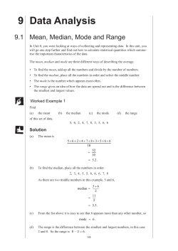
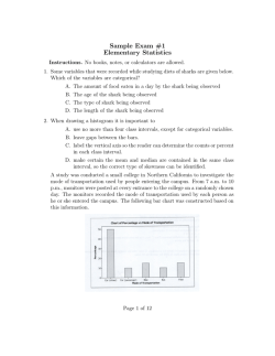
1020437_Ch03_p074-121
7/13/07
4:55 AM
Page 74
3
3.1 Measures of Central Tendency: Mode, Median,
and Mean
3.2 Measures of Variation
3.3 Percentiles and Box-and-Whisker Plots
While the individual man is an insolvable
puzzle, in the aggregate he becomes a
mathematical certainty. You can, for
example, never foretell what any one man
will do, but you can say with precision
what an average number will be up to.
—Arthur Conan Doyle,
The Sign of Four
For on-line student resources,
visit math.college.hmco.com/students and follow the
Statistics links to the Brase/Brase, Understandable Statistics,
9th edition web site.
74
Sherlock Holmes spoke these words to his
colleague Dr. Watson as the two were
unraveling a mystery. The detective was
implying that if a single member is drawn
at random from a population, we cannot
predict exactly what that member will look
like. However, there are some “average” features of
the entire population that an individual is likely to
possess. The degree of certainty with which we would
expect to observe such average features in any individual depends on our knowledge of the variation
among individuals in the population. Sherlock
Holmes has led us to two of the most important statistical concepts: average and variation.
1020437_Ch03_p074-121
7/13/07
4:55 AM
Page 75
Averages and Variation
P R EVI EW QU ESTIONS
What are commonly used measures of central tendency? What do
they tell you? (SECTION 3.1)
How do variance and standard deviation measure data spread?
Why is this important? (SECTION 3.2)
How do you make a box-and-whisker plot, and what does it tell
about the spread of the data? (SECTION 3.3)
FOCUS PROBLEM
The Educational Advantage
Is it really worth all the effort to get a college degree? From a philosophical
point of view, the love of learning is sufficient reason to get a college degree.
However, the U.S. Census Bureau also makes another relevant point.
Annually, college graduates (bachelor’s degree) earn on
average $23,291 more than high school graduates. This
means college graduates earn about 83.4% more than
high school graduates, and according to “Education
Pays” on the next page, the gap in earnings is increasing. Furthermore, as the College Board indicates, for
most Americans college remains relatively affordable.
After completing this chapter, you will be able to
answer the following questions.
(a) Does a college degree guarantee someone an 83.4%
increase in earnings over a high school degree?
Remember, we are using only averages from census
data.
(b) Using census data (not shown in “Education
Pays”), it is estimated that the standard deviation
of college-graduate earnings is about $8,500.
Compute a 75% Chebyshev confidence interval
centered on the mean ($51,206) for bachelor’s
degree earnings.
(c) How much does college tuition cost? That depends,
of course, on where you go to college. Construct a
weighted average. Using the data from “College
Affordable for Most,” estimate midpoints for the
75
1020437_Ch03_p074-121
76
7/13/07
Chapter 3
4:55 AM
Page 76
AVERAGES AND VARIATION
cost intervals. Say 46% of tuitions cost about $4,500; 21% cost about $7,500;
7% cost about $12,000; 8% cost about $18,000; 9% cost about $24,000; and
9% cost about $31,000. Compute the weighted average of college tuition
charged at all colleges. (See Problem 9 in the Chapter Review Problems.)
Education Pays
Average annual salary gap increases by
education level
$90,000
Advanced
degree
$88,471
$80,000
$70,000
Bachelor’s
degree
$51,206
$60,000
$50,000
9%
8%
7%
High school
diploma
$27,915
$40,000
$30,000
$20,000
1975
1985
1997
46%
2003
Source: The College Board
Source: Census Bureau
SECTION 3.1
$3,000 to
$5,999
21%
No diploma
$18,734
$10,000
9%
Measures of Central Tendency: Mode, Median, and Mean
FOCUS POINTS
•
•
•
•
•
Compute mean, median, and mode from raw data.
Interpret what mean, median, and mode tell you.
Explain how mean, median, and mode can be affected by extreme data values.
What is a trimmed mean? How do you compute it?
Compute a weighted average.
This section can be covered quickly. Good
discussion topics include The Story of Old
Faithful in Data Highlights, Problem 1:
Linking Concepts, Problem 1; and the trade
winds of Hawaii (Using Technology).
The average price of an ounce of gold is $420. The Zippy car averages 39 miles per
gallon on the highway. A survey showed the average shoe size for women is size 8.
In each of the preceding statements, one number is used to describe the entire
sample or population. Such a number is called an average. There are many ways
to compute averages, but we will study only three of the major ones.
The easiest average to compute is the mode.
The mode of a data set is the value that occurs most frequently.
EX AM P LE 1
Mode
Count the letters in each word of this sentence and give the mode. The numbers
of letters in the words of the sentence are
5
3
7
2
4
4
2
4
8
3
4
3
4
Scanning the data, we see that 4 is the mode because more words have 4 letters
than any other number. For larger data sets, it is useful to order—or sort—the
data before scanning them for the mode.
Not every data set has a mode. For example, if Professor Fair gives equal
numbers of A’s, B’s, C’s, D’s, and F’s, then there is no modal grade. In addition,
1020437_Ch03_p074-121
7/13/07
4:55 AM
Page 77
Section 3.1
Median
The notation x– (read “x tilde”) is sometimes
used to designate the median of a data set.
P ROCEDU R E
Measures of Central Tendency: Mode, Median, and Mean
77
the mode is not very stable. Changing just one number in a data set can change
the mode dramatically. However, the mode is a useful average when we want to
know the most frequently occurring data value, such as the most frequently
requested shoe size.
Another average that is useful is the median, or central value, of an ordered
distribution. When you are given the median, you know there are an equal number of data values in the ordered distribution that are above it and below it.
HOW TO FIND THE MEDIAN
The median is the central value of an ordered distribution. To find it,
1. Order the data from smallest to largest.
2. For an odd number of data values in the distribution,
Median Middle data value
3. For an even number of data values in the distribution,
Median EX AM P LE 2
Sum of middle two values
2
Median
What do barbecue-flavored potato chips cost? According to Consumer Reports,
Volume 66, No. 5, the prices per ounce in cents of the rated chips are
19
19
27
28
18
35
(a) To find the median, we first order the data, and then note that there are an even
number of entries. So the median is constructed using the two middle values.
18
19
19
27
28
35
middle values
Median 19 27
23 cents
2
(b) According to Consumer Reports, the brand with the lowest overall taste rating costs 35 cents per ounce. Eliminate that brand, and find the median
price per ounce for the remaining barbecue-flavored chips. Again order the
data. Note that there are an odd number of entries, so the median is simply
the middle value.
18
19
19
27
↑
⎟
middle value
28
Median middle value 19 cents
(c) One ounce of potato chips is considered a small serving. Is it reasonable to
budget about $10.45 to serve the barbecue-flavored chips to 55 people?
Yes, since the median price of the chips is 19 cents per small serving. This
budget for chips assumes that there is plenty of other food!
1020437_Ch03_p074-121
78
7/13/07
Chapter 3
4:55 AM
Page 78
AVERAGES AND VARIATION
The median uses the position rather than the specific value of each data entry.
If the extreme values of a data set change, the median usually does not change.
This is why the median is often used as the average for house prices. If one mansion costing several million dollars sells in a community of much-lower-priced
homes, the median selling price for houses in the community would be affected
very little, if at all.
GUIDED EXERCISE 1
Median and mode
Belleview College must make a report to the budget committee about the average credit hour load
a full-time student carries. (A 12-credit-hour load is the minimum requirement for full-time status.
For the same tuition, students may take up to 20 credit hours.) A random sample of 40 students
yielded the following information (in credit hours):
17
12
14
17
13
16
18
20
13
12
12
17
16
15
14
12
12
13
17
14
15
12
15
16
12
18
20
19
12
15
18
14
16
17
15
19
12
13
12
15
(a) Organize the data from smallest to largest
number of credit hours.
12
12
12
12
12
12
12
12 12 12
13
13
13
13
14
14
14
14 15 15
15 15 15 15
16
16 16
16
17
18
18
19 20 20
17
17
18
19
17 17
(b) Since there are an
(odd, even) number
of values, we add the two middle values and
divide by 2 to get the median. What is the
median credit hour load?
There are an even number of entries. The two
middle values are circled in part (a).
(c) What is the mode of this distribution? Is it
different from the median? If the budget
committee is going to fund the school according
to the average student credit hour load (more
money for higher loads), which of these two
averages do you think the college will use?
The mode is 12. It is different from the median.
Since the median is higher, the school will probably
use it and indicate that the average being used is the
median.
Median 15 15
15
2
Note: For small ordered data sets, we can easily scan the set to find the location of the median. However, for large ordered data sets of size n, it is convenient
to have a formula to find the middle of the data set.
For an ordered data set of size n,
Position of the middle value n1
2
For instance, if n 99, then the middle value is the (99 1)/2 or 50th data value
in the ordered data. If n 100, then (100 1)/2 50.5 tells us that the two
middle values are in the 50th and 51st positions.
1020437_Ch03_p074-121
7/13/07
4:55 AM
Page 79
Section 3.1
Mean
Most students will recognize the
computation procedure for the mean as the
process they follow to compute a simple
average of test grades.
Measures of Central Tendency: Mode, Median, and Mean
79
An average that uses the exact value of each entry is the mean (sometimes
called the arithmetic mean). To compute the mean, we add the values of all the
entries and then divide by the number of entries.
Mean Sum of all entries
Number of entries
The mean is the average usually used to compute a test average.
EX AM P LE 3
Mean
To graduate, Linda needs at least a B in biology. She did not do very well on her
first three tests; however, she did well on the last four. Here are her scores:
58
67
60
84
93
98
100
Compute the mean and determine if Linda’s grade will be a B (80 to 89 average)
or a C (70 to 79 average).
SOLUTION:
Mean 58 67 60 84 93 98 100
Sum of scores
7
Number of scores
560
80
7
Since the average is 80, Linda will get the needed B.
When we compute the mean, we sum the given data. There is a
convenient notation to indicate the sum. Let x represent any value in the data
set. Then the notation
COMMENT
兺x (read “the sum of all given x values”)
means that we are to sum all the data values. In other words, we are to sum
all the entries in the distribution. The summation symbol 兺 means sum the
following and is capital sigma, the S of the Greek alphabet.
Formula for the mean
P ROCEDU R E
The symbol for the mean of a sample distribution of x values is denoted by x
(read “x bar”). If your data comprise the entire population, we use the symbol m
(lowercase Greek letter mu, pronounced “mew”) to represent the mean.
HOW TO FIND THE MEAN
1. Compute ∑x; that is, find the sum of all the data values.
2. Divide the total by the number of data values.
Sample statistic x–
Population parameter m
x
ax
n
m
ax
N
where n number of data values in the sample
N number of data values in the population
1020437_Ch03_p074-121
80
7/13/07
Chapter 3
4:55 AM
Page 80
AVERAGES AND VARIATION
This is a good time to review calculator
procedures with students, with particular
emphasis on order of operations.
CALCULATOR NOTE It is very easy to compute the mean on any calculator:
Simply add the data values and divide the total by the number of data.
However, on calculators with a statistics mode, you place the calculator in
that mode, enter the data, and then press the key for the mean. The key is
usually designated x. Because the formula for the population mean is the same
as that for the sample mean, the same key gives the value for m.
We have seen three averages: the mode, the median, and the mean. For later
work, the mean is the most important. A disadvantage of the mean, however, is
that it can be affected by exceptional values.
A resistant measure is one that is not influenced by extremely high or low data
values. The mean is not a resistant measure of center because we can make the
mean as large as we want by changing the size of only one data value. The
median, on the other hand, is more resistant. However, a disadvantage of
the median is that it is not sensitive to the specific size of a data value.
A measure of center that is more resistant than the mean but still sensitive to
specific data values is the trimmed mean. A trimmed mean is the mean of the data
values left after “trimming” a specified percentage of the smallest and largest data
values from the data set. Usually a 5% trimmed mean is used. This implies that
we trim the lowest 5% of the data as well as the highest 5% of the data. A similar procedure is used for a 10% trimmed mean.
Resistant measure
Trimmed mean
HOW TO COMPUTE A 5% TRIMMED MEAN
P ROCEDU R E
1. Order the data from smallest to largest.
2. Delete the bottom 5% of the data and the top 5% of the data. Note: If
the calculation of 5% of the number of data values does not produce a
whole number, round to the nearest integer.
3. Compute the mean of the remaining 90% of the data.
GUIDED EXERCISE 2
Mean and trimmed mean
Barron’s Profiles of American Colleges, 19th Edition, lists average class size for introductory lecture courses at each of the profiled institutions. A sample of 20 colleges and universities in
California showed class sizes for introductory lecture courses to be
14
20
20
20
20
23
25
30
30
30
35
35
35
40
40
42
50
50
80
80
(a) Compute the mean for the entire sample.
Add all the values and divide by 20:
x
(b) Compute a 5% trimmed mean for the sample.
兺x
719
⬇ 36.0
n
20
The data are already ordered. Since 5% of 20 is 1,
we eliminate one data value from the bottom of the
list and one from the top. These values are circled in
the data set. Then take the mean of the remaining
18 entries.
5% trimmed mean 兺x
625
⬇ 34.7
n
18
Continued
1020437_Ch03_p074-121
7/13/07
4:55 AM
Page 81
Section 3.1
GUIDED EXERCISE 2
Measures of Central Tendency: Mode, Median, and Mean
81
continued
(c) Find the median for the original data set.
Note that the data are already ordered.
Median 30 35
32.5
2
(d) Find the median of the 5% trimmed data set.
Does the median change when you trim the
data?
The median is still 32.5. Notice that trimming the
same number of entries from both ends leaves the
middle position of the data set unchanged.
(e) Is the trimmed mean or the original mean closer
to the median?
The trimmed mean is closer to the median.
TE C H N OTE S
Minitab, Excel, and TI-84Plus/TI-83Plus calculators all provide the mean and median
of a data set. Minitab and Excel also provide the mode. The TI-84Plus/TI-83Plus
calculators sort data, so you can easily scan the sorted data for the mode. Minitab
provides the 5% trimmed mean, as does Excel.
All this technology is a wonderful aid for analyzing data. However, a measurement has no meaning if you do not know what it represents or how a change in data
values might affect the measurement. The defining formulas and procedures for
computing the measures tell you a great deal about the measures. Even if you use a
calculator to evaluate all the statistical measures, pay attention to the information
the formulas and procedures give you about the components or features of the
measurement.
CR ITICAL
TH I N K I NG
The ideas at the right can be used to review
levels of measurement and link some of
those concepts to the material in this
section.
Data types and averages
Distribution shapes and averages
In Chapter 1, we examined four levels of data: nominal, ordinal, interval, and
ratio. The mode (if it exists) can be used with all four levels, including nominal.
For instance, the modal color of all passenger cars sold last year might be blue.
The median may be used with data at the ordinal level or above. If we ranked the
passenger cars in order of customer satisfaction level, we could identify the
median satisfaction level. For the mean, our data need to be at the interval or
ratio level (although there are exceptions in which the mean of ordinal-level data
is computed). We can certainly find the mean model year of used passenger cars
sold or the mean price of new passenger cars.
Another issue of concern is that of taking the average of averages. For instance,
if the values $520, $640, $730, $890, and $920 represent the mean monthly rents
for five different apartment complexes, we can’t say that $740 (the mean of the
five numbers) is the mean monthly rent of all the apartments. We need to know the
number of apartments in each complex before we can determine an average based
on the number of apartments renting at each designated amount.
In general, when a data distribution is mound-shaped symmetrical, the values for the mean, median, and mode are the same or almost the same. For
skewed-left distributions, the mean is less than the median and the median is less
than the mode. For skewed-right distributions, the mode is the smallest value,
the median is the next largest, and the mean is the largest. Figure 3-1 shows the
general relationships among the mean, median, and mode for different types of
distributions.
1020437_Ch03_p074-121
82
7/13/07
Chapter 3
4:55 AM
Page 82
AVERAGES AND VARIATION
FIGURE 3-1
Distribution Types and Averages
(a) Mound-shaped symmetric
(b) Skewed left
(c) Skewed right
Mean Mode
Median
Mean
Median
Mode
Mode Mean
Median
Weighted Average
Sometimes we wish to average numbers, but we want to assign more importance, or weight, to some of the numbers. For instance, suppose your professor
tells you that your grade will be based on a midterm and a final exam, each of
which is based on 100 possible points. However, the final exam will be worth
60% of the grade and the midterm only 40%. How could you determine an
average score that would reflect these different weights? The average you need is
the weighted average.
Weighted average
Weighted averages have many real-world
applications. This is a good time to mention
that the sum of the weights may or may
not be 1, depending on the application.
Weighted average 兺xw
兺w
where x is a data value and w is the weight assigned to that data value. The
sum is taken over all data values.
EX AM P LE 4
Weighted average
Suppose your midterm test score is 83 and your final exam score is 95. Using
weights of 40% for the midterm and 60% for the final exam, compute the
weighted average of your scores. If the minimum average for an A is 90, will you
earn an A?
SOLUTION: By the formula, we multiply each score by its weight and add the
results together. Then we divide by the sum of all the weights. Converting the
percentages to decimal notation, we get
Weighted average 8310.402 9510.602
0.40 0.60
33.2 57
90.2
1
Your average is high enough to earn an A.
TE C H N OTE S
The TI-84Plus/TI-83Plus calculators directly support weighted averages. Both Excel
and Minitab can be programmed to provide the averages.
TI-84Plus/TI-83Plus Enter the data into one list, such as L1, and the corresponding
weights into another list, such as L2. Then press Stat ➤ Calc ➤ 1: 1-Var Stats. Enter the
list containing the data, followed by a comma and the list containing the weights.
1020437_Ch03_p074-121
7/13/07
4:55 AM
Page 83
Section 3.1
VI EWPOI NT
83
Measures of Central Tendency: Mode, Median, and Mean
What’s Wrong with Pitching Today?
One way to answer this question is to look at averages. Batting averages and
average hits per game are shown for selected years from 1901 to 2000 (Source: The Wall Street Journal).
Year
1901
1920
1930
1941
1951
1961
1968
1976
1986
2000
B.A.
0.277
0.284
0.288
0.267
0.263
0.256
0.231
0.256
0.262
0.276
Hits
19.2
19.2
20.0
18.4
17.9
17.3
15.2
17.3
17.8
19.1
A quick scan of the averages shows that batting averages and average hits per game are virtually
the same as almost 100 years ago. It seems there is nothing wrong with today’s pitching! So
what’s changed? For one thing, the rules have changed! The strike zone is considerably smaller
than it once was, and the pitching mound is lower. Both give the hitter an advantage over the
pitcher. Even so, pitchers don’t give up hits with any greater frequency than they did a century
ago (look at the averages). However, modern hits go much farther, which is something a pitcher
can’t control.
SECTION 3.1
P ROB LEM S
1. Statistical Literacy Consider the mode, median, and mean. Which average represents the middle value of a data distribution? Which average represents the
most frequent value of a distribution? Which average takes all the specific values
into account?
Tables and art to accompany margin
answers may be found in the back of the
book.
2. Statistical Literacy What symbol is used for the arithmetic mean when it is a
sample statistic? What symbol is used when the arithmetic mean is a population
parameter?
1. Median; mode; mean.
2. Statistic, x; parameter, m.
3. Mean, median, and mode are
approximately equal.
4. (a) Mean, median, and mode if it exists.
(b) Mode if it exists.
(c) Mean, median, and mode if it exists.
3. Critical Thinking When a distribution is mound-shaped symmetrical, what is
the general relationship among the values of the mean, median, and mode?
5. (a) Mode 5; median 4;
mean 3.8.
(b) Mode.
(c) Mean, median, and mode.
(d) Mode, median.
5. Critical Thinking Consider the numbers
6. (a) Mode 2; median 3; mean 4.6.
(b) Mode 7; median 8;
mean 9.6.
(c) Corresponding values are 5 more than
original averages. In general, adding
the same constant c to each data
value results in the mode, median,
and mean increasing by c units.
4. Critical Thinking Consider the following types of data that were obtained from
a random sample of 49 credit card accounts. Identify all the averages (mean,
median, or mode) that can be used to summarize the data.
(a) Outstanding balance on each account
(b) Name of credit card (e.g., MasterCard, Visa, American Express, etc.)
(c) Dollar amount due on next payment
2 3 4 5 5
(a) Compute the mode, median, and mean.
(b) If the numbers represented codes for the colors of T-shirts ordered from a
catalog, which average(s) would make sense?
(c) If the numbers represented one-way mileages for trails to different lakes,
which average(s) would make sense?
(d) Suppose the numbers represent survey responses from 1 to 5, with 1 disagree strongly, 2 disagree, 3 agree, 4 agree strongly, and 5 agree
very strongly. Which averages make sense?
6. Critical Thinking: Data Transformation In this problem, we explore the effect
on the mean, median, and mode of adding the same number to each data value.
Consider the data set 2, 2, 3, 6, 10.
(a) Compute the mode, median, and mean.
(b) Add 5 to each of the data values. Compute the mode, median, and mean.
(c) Compare the results of parts (a) and (b). In general, how do you think the
mode, median, and mean are affected when the same constant is added to
each data value in a set?
1020437_Ch03_p074-121
84
7/13/07
Chapter 3
4:55 AM
Page 84
AVERAGES AND VARIATION
7.(a) Mode 2; median 3; mean 4.6.
(b) Mode 10; median 15;
mean 23.
(c) Corresponding values are 5 times
the original averages. In general,
multiplying each data value by a
constant c results in the mode,
median, and mean changing by a
factor of c.
(d) Mode 177.8 cm; median 172.72 cm; mean 180.34 cm.
7. Critical Thinking: Data Transformation In this problem, we explore the effect
on the mean, median, and mode of multiplying each data value by the same
number. Consider the data set 2, 2, 3, 6, 10.
(a) Compute the mode, median, and mean.
(b) Multiply each data value by 5. Compute the mode, median, and mean.
(c) Compare the results of parts (a) and (b). In general, how do you think the
mode, median, and mean are affected when each data value in a set is multiplied by the same constant?
(d) Suppose you have information about average heights of a random sample of
airplane passengers. The mode is 70 inches, the median is 68 inches, and the
mean is 71 inches. To convert the data into centimeters, multiply each data
value by 2.54. What are the values of the mode, median, and mean in
centimeters?
8. (a) Mean increases; median remains
same.
(b) Mean decreases; median remains
same.
(c) Both decrease.
8. Critical Thinking Consider a data set of 15 distinct measurements with mean A
and median B.
Problem 8 helps students understand how
specific data values enter into computations
of the mean, median, and mode.
(a) If the highest number were increased, what would be the effect on the
median and mean? Explain.
(b) If the highest number were decreased to a value still larger than B, what
would be the effect on the median and mean?
(c) If the highest number were decreased to a value smaller than B, what would
be the effect on the median and mean?
9. Environmental Studies: Death Valley How hot does it get in Death Valley? The
following data are taken from a study conducted by the National Park System,
of which Death Valley is a unit. The ground temperatures (8F) were taken from
May to November in the vicinity of Furnace Creek.
9. Mean ⬇ 167.3 °F;
median 171 °F;
mode 178 °F.
146
152
168
174
180
178
179
180
178
178
168
165
152
144
Compute the mean, median, and mode for these ground temperatures.
10. x ⬇ 6.2;
me
mode 7.
10. Ecology: Wolf Packs How large is a wolf pack? The following information is
from a random sample of winter wolf packs in regions of Alaska, Minnesota,
Michigan, Wisconsin, Canada, and Finland (Source: The Wolf, by L. D. Mech,
University of Minnesota Press). Winter pack size:
13
10
7
5
7
7
2
4
3
2
3
15
4
4
2
8
7
8
Compute the mean, median, and mode for the size of winter wolf packs.
11. (a) x ⬇ 3.27;
median 3;
mode 3.
(b) x ⬇ 4.21;
median 2;
mode 1.
(c) Lower Canyon mean is greater;
median and mode are less.
(d) Trimmed mean 3.75 and is
closer to Upper Canyon mean.
11. Medical: Injuries The Grand Canyon and the Colorado River are beautiful,
rugged, and sometimes dangerous. Thomas Myers is a physician at the park
clinic in Grand Canyon Village. Dr. Myers has recorded (for a 5-year period) the
number of visitor injuries at different landing points for commercial boat trips
down the Colorado River in both the Upper and Lower Grand Canyon (Source:
Fateful Journey by Myers, Becker, Stevens).
Upper Canyon: Number of Injuries per Landing Point Between North Canyon
and Phantom Ranch
2
3
1
1
3
4
6
9
3
1
3
Lower Canyon: Number of Injuries per Landing Point Between Bright Angel
and Lava Falls
8
1
1
0
6
7
2
14
3
0
1
13
2
1
(a) Compute the mean, median, and mode for injuries per landing point in the
Upper Canyon.
(b) Compute the mean, median, and mode for injuries per landing point in the
Lower Canyon.
(c) Compare the results of parts (a) and (b).
1020437_Ch03_p074-121
7/13/07
4:55 AM
Page 85
Section 3.1
85
Measures of Central Tendency: Mode, Median, and Mean
(d) The Lower Canyon stretch had some extreme data values. Compute a 5%
trimmed mean for this region, and compare this result to the mean for the
Upper Canyon computed in part (a).
12. (a) x ⬇ 26.3 yr; median 25.5 yr;
mode 25 yr.
(b) Median; answers are very close.
12. Football: Age of Professional Players How old are professional football players? The 11th Edition of The Pro Football Encyclopedia gave the following
information. Random sample of pro football player ages in years:
24
23
25
23
30
29
28
26
33
29
24
37
25
23
22
27
28
25
31
29
25
22
31
29
22
28
27
26
23
21
25
21
25
24
22
26
25
32
26
29
(a) Compute the mean, median, and mode of the ages.
(b) Compare the averages. Does one seem to represent the age of the pro football players most accurately? Explain.
13. (a) x $136.15; median $66.50;
mode $60.
(b) Trimmed mean ⬇ $121.28; yes.
(c) Median, as well as low and high
price.
13. Leisure: Maui Vacation How expensive is Maui? If you want a vacation rental
condominium (up to four people), visit the Brase/Brase statistics site at
http://math.college.hmco.com/students, find the link to Maui, and then search
for accommodations. The Maui News gave the following costs in dollars per day
for a random sample of condominiums located throughout the island of Maui.
89
50
68
60
375
55
500
71
40
350
60
50
250
45
45
125
235
65
60
130
(a) Compute the mean, median, and mode for the data.
(b) Compute a 5% trimmed mean for the data, and compare it with the mean
computed in part (a). Does the trimmed mean more accurately reflect the
general level of the daily rental costs?
(c) If you were a travel agent and a client asked about the daily cost of renting a
condominium on Maui, what average would you use? Explain. Is there any
other information about the costs that you think might be useful, such as the
spread of the costs?
14. 87.65.
14. Grades: Weighted Average In your biology class, your final grade is based on
several things: a lab score, scores on two major tests, and your score on the final
exam. There are 100 points available for each score. However, the lab score is
worth 25% of your total grade, each major test is worth 22.5%, and the final
exam is worth 30%. Compute the weighted average for the following scores: 92
on the lab, 81 on the first major test, 93 on the second major test, and 85 on the
final exam.
15. 8.5.
15. Merit Pay Scale: Weighted Average At General Hospital, nurses are given performance evaluations to determine eligibility for merit pay raises. The supervisor
rates the nurses on a scale of 1 to 10 (10 being the highest rating) for several
activities: promptness, record keeping, appearance, and bedside manner with
patients. Then an average is determined by giving a weight of 2 for promptness,
3 for record keeping, 1 for appearance, and 4 for bedside manner with patients.
What is the average rating for a nurse with ratings of 9 for promptness, 7 for
record keeping, 6 for appearance, and 10 for bedside manner?
16. (a) 67.1 mg/l.
(b) No; the average chlorine
compound concentration (mg/l)
seems a bit too high.
16. EPA: Wetlands Where does all the water go? According to the Environmental
Protection Agency (EPA), in a typical wetland environment, 38% of the water is
outflow; 47% is seepage; 7% evaporates; and 8% remains as water volume in the
ecosystem (Reference: United States Environmental Protection Agency Case Studies
Report 832-R-93-005). Chloride compounds as residuals from residential areas are
a problem for wetlands. Suppose that in a particular wetland environment the following concentrations (mg/l) of chloride compounds were found: outflow, 64.1;
seepage, 75.8; remaining due to evaporation, 23.9; in the water volume, 68.2.
(a) Compute the weighted average of chlorine compound concentration (mg/l)
for this ecological system.
1020437_Ch03_p074-121
86
7/13/07
Chapter 3
4:55 AM
Page 86
AVERAGES AND VARIATION
(b) Suppose the EPA has established an average chlorine compound concentration
target of no more than 58 mg/l. Comment on whether this wetlands system
meets the target standard for chlorine compound concentration.
17. Expand Your Knowledge: Harmonic Mean When data consist of rates of change,
such as speeds, the harmonic mean is an appropriate measure of central tendency.
17. Approx. 66.67 mph.
Harmonic mean n
兺 1x
, assuming no data value is 0
Suppose you drive 60 miles per hour for 100 miles, then 75 miles per hour for
100 miles. Use the harmonic mean to find your average speed.
18. Expand Your Knowledge: Geometric Mean When data consist of percentages,
ratios, growth rates, or other rates of change, the geometric mean is a useful
measure of central tendency. For n data values,
18. Approx. 1.09247.
n
Geometric mean 2product of the n data values
assuming all data values are positive
To find the average growth factor over 5 years of an investment in a mutual fund
with growth rates of 10% the first year, 12% the second year, 14.8% the third
year, 3.8% the fourth year, and 6% the fifth year, take the geometric mean of 1.10,
1.12, 1.148, 1.038, and 1.16. Find the average growth factor of this investment.
Note that for the same data, the relationships among the harmonic, geometric,
and arithmetic means are: harmonic mean geometric mean arithmetic mean
(Source: Oxford Dictionary of Statistics).
SECTION 3.2
Measures of Variation
FOCUS POINTS
• Find the range, variance, and standard deviation.
• Compute the coefficient of variation from raw data. Why is the coefficient of variation important?
• Apply Chebyshev’s theorem to raw data. What does a Chebyshev interval tell us?
An average is an attempt to summarize a set of data using just one number. As
some of our examples have shown, an average taken by itself may not always be
very meaningful. We need a statistical cross-reference that measures the spread of
the data.
The range is one such measure of variation.
The range is the difference between the largest and smallest values of a data
distribution.
EX AM P LE 5
Most professors find that this section
contains concepts that are new to many
students. A little more class time may be
needed.
Range
A large bakery regularly orders cartons of Maine blueberries. The average weight
of the cartons is supposed to be 22 ounces. Random samples of cartons from two
suppliers were weighed. The weights in ounces of the cartons were
Supplier I:
Supplier II:
17
22
22
22
27
17
19
20
27
27
(a) Compute the range of carton weights from each supplier.
Range Largest value Smallest value
Supplier I range 27 17 10 ounces
Supplier II range 27 17 10 ounces
1020437_Ch03_p074-121
7/13/07
4:55 AM
Page 87
Section 3.2
87
Measures of Variation
(b) Compute the mean weight of cartons from each supplier. In both cases the
mean is 22 ounces.
(c) Look at the two samples again. The samples have the same range and mean.
How do they differ? The bakery uses one carton of blueberries in each blueberry muffin recipe. It is important that the cartons be of consistent weight so
that the muffins turn out right.
Supplier I provides more cartons that have weights closer to the mean. Or, put
another way, the weights of cartons from Supplier I are more clustered around
the mean. The bakery might find Supplier I more satisfactory.
As we see in Example 5, although the range tells the difference between the
largest and smallest values in a distribution, it does not tell us how much other
values vary from one another or from the mean.
Variance and Standard Deviation
Blueberry patch
Variance and standard deviation
There are many ways to measure data
spread, and s is only one way (the range is
another way). However, just as standard
time is the time to which most people refer,
standard deviation is the measure of data
spread to which most people refer.
P ROCEDU R E
We need a measure of the distribution or spread of data around an expected
value (either x or m). The variance and standard deviation provide such
measures. Formulas and rationale for these measures are described in the next
Procedure display. Then, examples and guided exercises show how to compute
and interpret these measures.
As we will see later, the formulas for variance and standard deviation differ
slightly depending on whether we are using a sample or the entire population.
HOW TO COMPUTE THE SAMPLE VARIANCE AND SAMPLE
STANDARD DEVIATION
Quantity
Description
x
The variable x represents a data value or outcome.
Mean
兺x
x
n
xx
This is the average of the data values, or what you ”expect” to
happen the next time you conduct the statistical experiment. Note
that n is the sample size.
兺(x x )2
The expression 兺(x x)2 is called the sum of squares. The
(x x) quantity is squared to make it nonnegative. The sum is
over all the data. If you don’t square (x x), then the sum
兺(x x)is equal to 0 because the negative values cancel the
positive values. This occurs even if some (x x) values are large,
indicating a large deviation or risk.
Sum of squares
兺(x x )2
or
(兺 x)2
兺x2 n
This is an algebraic simplification of the sum of squares that
is easier to compute.
The defining formula for the sum of squares is the upper one.
The computation formula for the sum of squares is the lower
one. Both formulas give the same result.
Sample variance
兺(x x )2
s2 n1
The sample variance is s2. The variance can be thought of as a
kind of average of the (x x)2 values. However, for technical
or
s2 兺x2 (兺x)2n
n1
This is the difference between what happened and what you
expected to happen. This represents a “deviation” away from what
you “expect” and is a measure of risk.
reasons, we divide the sum by the quantity n 1 rather than n.
This gives us the best mathematical estimate for the sample
variance.
Continue
1020437_Ch03_p074-121
88
7/13/07
Chapter 3
4:55 AM
Page 88
AVERAGES AND VARIATION
PROCEDURE
continued
The defining formula for the variance is the upper one. The
computation formula for the variance is the lower one. Both
formulas give the same result.
Sample standard
deviation
s
v
兺( x x )2
n1
s
v
兺x (兺x)2n
n1
or
Some students have trouble comprehending
the information contained in a formula. It
may be useful to verbalize the formula for s.
It says to compare each data value to the
mean, square the difference, sum the
squares of the differences, then divide by the
quantity (n 1) and, finally, take the
square root of the result.
2
This is sample standard deviation, s. Why do we take the square
root? Well, if the original x units were, say, days or dollars, then the
s2 units would be days squared or dollars squared (wow, what’s
that?). We take the square root to return to the original units of the
data measurements. The standard deviation can be thought of as a
measure of variability or risk. Larger values of s imply greater variability in the data.
The defining formula for the standard deviation is the upper
one. The computation formula for the standard deviation is the
COMMENT Why is s called a sample standard deviation? First, it is com-
puted from sample data. Then why do we use the word standard in the
name? We know s is a measure of deviation or risk. You should be aware
that there are other statistical measures of risk that we have not yet mentioned. However, s is the one that everyone uses, so it is called the “standard” (like standard time).
In statistics, the sample standard deviation and sample variance are used to
describe the spread of data about the mean x. The next example shows how to
find these quantities by using the defining formulas. Guided Exercise 3 shows
how to use the computation formulas.
As you will discover, for “hand” calculations, the computation formulas for
s2 and s are much easier to use. However, the defining formulas for s2 and s
emphasize the fact that the variance and standard deviation are based on the differences between each data value and the mean.
Defining formulas (sample statistics)
Sample variance s2 兺1x x2 2
(1)
n1
Sample standard deviation s v
兺1x x2 2
n1
(2)
where x is a member of the data set, x is the mean, and n is the number of
data values. The sum is taken over all data values.
Computation formulas (sample statistics)
Sample variance s2 兺x2 1兺x2 2n
(3)
n1
Sample standard deviation s v
兺x2 1兺x2 2n
n1
(4)
where x is a member of the data set, x is the mean, and n is the number of
data values. The sum is taken over all data values.
1020437_Ch03_p074-121
7/13/07
4:55 AM
Page 89
Section 3.2
EX AM P LE 6
89
Measures of Variation
Sample standard deviation (defining formula)
Big Blossom Greenhouse was commissioned to develop an extra large rose for the
Rose Bowl Parade. A random sample of blossoms from Hybrid A bushes yielded
the following diameters (in inches) for mature peak blooms.
2
3
3
8
10
10
Find the sample variance and standard deviation.
SOLUTION: Several steps are involved in computing the variance and standard
deviation. A table will be helpful (see Table 3-1 on the next page). Since n 6,
we take the sum of the entries in the first column of Table 3-1 and divide by 6 to
find the mean x.
x
兺x
36
6.0 inches
n
6
TABLE 3-1
Diameters of Rose Blossoms (in inches)
Column I
x
Column II
xx
Column III
(x x )2
2
2 6 4
(4)2 16
3
3 6 3
(3)2 9
3
3 6 3
(3)2 9
8
8 6
2
(2)2 4
10
10 6 4
(4)2 16
10
10 6 4
(4)2 16
兺(x x )2 70
兺x 36
Using this value for x, we obtain Column II. Square each value in the second column to obtain Column III, and then add the values in Column III. To get the sample variance, divide the sum of Column III by n 1. Since n 6, n 1 5.
s2 兺1x x 2 2
n1
70
14
5
Now obtain the sample standard deviation by taking the square root of the
variance.
s 2s2 214 ⬇ 3.74
(Use a calculator to compute the square root. Because of rounding, we use the
approximately equal symbol, ⬇.)
GUIDED EXERCISE 3
Sample standard deviation (computation formula)
Big Blossom Greenhouse gathered another random sample of mature peak blooms from Hybrid B.
The six blossoms had the following widths (in inches):
5
5
5
6
7
8
(a) Again, we will construct a table so that we can
find the mean, variance, and standard deviation
more easily. In this case, what is the value of n?
Find the sum of Column I in Table 3-2, and
compute the mean.
n 6. The sum of Column I is 兺x 36, so the
mean is
x
36
6
6 inches
Continue
1020437_Ch03_p074-121
90
7/13/07
Chapter 3
GUIDED EXERCISE 3
4:55 AM
Page 90
AVERAGES AND VARIATION
continued
TABLE 3-2 Complete Columns I and II
I
x
TABLE 3-3 Completion of Table 3-2
II
x2
I
x
II
x2
5
5
25
5
5
25
5
5
25
6
6
36
7
7
49
8
8
64
兺x 36
兺x2 224
兺x 兺 x2 (b) What is the value of n? of n 1? Use the computation formula to find the sample variance s2.
Note: Be sure to distinguish between 兺x2 and
(兺x)2. For 兺x2, you square the x values first and
then sum them. For (兺x)2, you sum the x values
first and then square the result.
(c) Use a calculator to find the square root of the
variance. Is this the standard deviation?
n 6; n 1 5.
s2 兺x2 兺x2n
n1
224 3626
8
1.6
5
5
s 2s2 21.6 ⬇ 1.26
Yes.
Let’s summarize and compare the results of Guided Exercise 3 and Example
6. The greenhouse found the following blossom diameters for Hybrid A and
Hybrid B:
Hybrid A: Mean, 6.0 inches; standard deviation, 3.74 inches
Hybrid B: Mean, 6.0 inches; standard deviation, 1.26 inches
In both cases, the means are the same: 6 inches. But the first hybrid has a larger
standard deviation. This means that the blossoms of Hybrid A are less consistent
than those of Hybrid B. If you want a rosebush that occasionally has 10-inches
blooms and 2-inches blooms, use the first hybrid. But if you want a bush that
consistently produces roses close to 6 inches across, use Hybrid B.
This is a good time to discuss rounding of
calculated answers.
Rounding errors cannot be completely eliminated, even if
a computer or calculator does all the computations. However, software and calculator routines are designed to minimize the error. If the mean is rounded, the
value of the standard deviation will change slightly depending on how much the
mean is rounded. If you do your calculations “by hand” or reenter intermediate
values into a calculator, try to carry one or two more digits than occur in the
original data. If your resulting answers vary slightly from those in this text,
do not be overly concerned. The text answers are computer- or calculatorgenerated.
In most applications of statistics, we work with a random sample of data rather
than the entire population of all possible data values. However, if we have data for
ROUNDING NOTE
1020437_Ch03_p074-121
7/13/07
4:55 AM
Page 91
Section 3.2
Population mean variance and
standard deviation
This is a good time once again to stress the
difference between sample data and
population data. It is interesting to note that
the concept of population variance s2 was
borrowed from classical mechanics. If you
check a college physics textbook, you will
find that the formula for s2 is essentially
the same formula physicists use for the
second moment.
91
Measures of Variation
the entire population, we can compute the population mean m, population variance
s 2, and population standard deviation s (lowercase Greek letter sigma) using the
following formulas:
Population Parameters
Population mean m 兺x
N
Population variance s2 兺(x m)2
N
Population standard deviation s v
兺1x m2 2
N
where N is the number of data values in the population and x represents the
individual data values of the population.
We note that the formula for m is the same as the formula for x (the sample mean)
and the formulas for s2 and s are the same as those for s2 and s (sample variance
and sample standard deviation), except that the population size N is used instead
of n 1. Also, m is used instead of x in the formulas for s2 and s.
In the formulas for s and s we use n 1 to compute s, and N to compute s.
Why? The reason is that N (capital letter) represents the population size,
whereas n (lowercase letter) represents the sample size. Since a random sample usually will not contain extreme data values (large or small), we divide by
n 1 in the formula for s to make s a little larger than it would have been had
we divided by n. Courses in advanced theoretical statistics show that this procedure will give us the best possible estimate for the standard deviation s. In fact,
s is called the unbiased estimate for s. If we have the population of all data values, then extreme data values are, of course, present, so we divide by N instead
of N 1.
The computation formula for the population standard deviation is
COMMENT
s
v
兺x2 1兺x2 2N
N
We’ve seen that the standard deviation (sample or population) is a measure of
data spread. We will use the standard deviation extensively in later chapters.
TE C H N OTE
In Chapter 6 we will use the standard
deviation to study standard z values and
areas under normal curves. In Chapters 8
and 9 we will use it to study the inferential
statistics topics of estimation and testing.
The standard deviation will appear again in
our study of regression and correlation.
Most scientific or business calculators have a statistics mode and provide the mean
and sample standard deviation directly. The TI-84Plus/TI-83Plus calculators, Excel,
and Minitab provide the median and several other measures as well.
Many technologies display only the sample standard deviation s. You can quickly
compute s if you know s by using the formula
v
ss
n1
n
The mean given in displays can be interpreted as the sample mean x or the population
mean m as appropriate.
The following three displays show output for the hybrid rose data of Guided
Exercise 3.
TI-84Plus/TI-83Plus Display Press STAT ➤ CALC ➤ 1:1-Var Stats. Sx is the sample standard deviation. sx is the population standard deviation.
1020437_Ch03_p074-121
92
7/13/07
Chapter 3
4:55 AM
Page 92
AVERAGES AND VARIATION
Excel Display Menu choices: Tools ➤ Data Analysis ➤ Descriptive Statistics. Check the
summary statistics box. The standard deviation is the sample standard deviation.
Column 1
6
Mean
0.516398
Standard Error
5.5
Median
5
Mode
Standard Deviation 1.264911
1.6
Sample Variance
–0.78125
Kurtosis
0.889391
Skewness
3
Range
5
Minimum
8
Maximum
36
Sum
6
Count
Minitab Display Menu choices: Stat ➤ Basic Statistics ➤ Display Descriptive Statistics.
StDev is the sample standard deviation. TrMean is a 5% trimmed mean.
N
6
Minimum
5.000
Mean
Median
TrMean
StDev
6.000
5.500
6.000
1.265
Maximum
Q1
Q3
8.000
5.000
7.250
SE Mean
0.516
Now let’s look at two immediate applications of the standard deviation. The first
is the coefficient of variation, and the second is Chebyshev’s theorem.
Coefficient of Variation
Coefficient of variation
A good class discussion topic about CV can
be found in Linking Concepts, Problem 3
(robin eggs and elephants). See also Data
Highlights, Problem 1 (Old Faithful).
A disadvantage of the standard deviation as a comparative measure of variation is that it depends on the units of measurement. This means that it is difficult to use the standard deviation to compare measurements from different
populations. For this reason, statisticians have defined the coefficient of variation, which expresses the standard deviation as a percentage of the sample or
population mean.
If x and s represent the sample mean and sample standard deviation, respectively, then the sample coefficient of variation CV is defined to be
CV s
ⴢ 100
x
1020437_Ch03_p074-121
7/13/07
4:55 AM
Page 93
Section 3.2
93
Measures of Variation
If m and s represent the population mean and population standard deviation,
respectively, then the population coefficient of variation CV is defined to be
CV s
ⴢ 100
m
Notice that the numerator and denominator in the definition of CV have the
same units, so CV itself has no units of measurement. This gives us the advantage
of being able to directly compare the variability of two different populations
using the coefficient of variation.
In the next example and guided exercise, we will compute the CV of a population and of a sample and then compare the results.
EX AM P LE 7
Coefficient of variation
The Trading Post on Grand Mesa is a small, family-run store in a remote part of
Colorado. The Grand Mesa region contains many good fishing lakes, so the
Trading Post sells spinners (a type of fishing lure). The store has a very limited
selection of spinners. In fact, the Trading Post has only eight different types of
spinners for sale. The prices (in dollars) are
2.10
1.95
2.60
2.00
1.85
2.25
2.15
2.25
Since the Trading Post has only eight different kinds of spinners for sale, we consider the eight data values to be the population.
(a) Use a calculator with appropriate statistics keys to verify that for the Trading
Post data, m ⬇ $2.14 and s ⬇ $0.22.
SOLUTION: Since the computation formulas for x and m are identical, most calculators provide the value of x only. Use the output of this key for m. The
computation formulas for the sample standard deviation s and the population
standard deviation s are slightly different. Be sure that you use the key for s
(sometimes designated as sn or sx).
(b) Compute the CV of prices for the Trading Post and comment on the meaning
of the result.
SOLUTION:
CV s
0.22
100 100 10.28%
m
2.14
The coefficient of variation can be thought of as a measure of the spread of
the data relative to the average of the data. Since the Trading Post is very
small, it carries a small selection of spinners that are all priced similarly. The
CV tells us that the standard deviation of the spinner prices is only 10.28%
of the mean.
GUIDED EXERCISE 4
Coefficient of variation
Cabela’s in Sidney, Nebraska, is a very large outfitter that carries a broad selection of fishing tackle.
It markets its products nationwide through a catalog service. A random sample of 10 spinners from
Cabela’s extensive spring catalog gave the following prices (in dollars):
1.69
1.49
3.09
1.79
1.39
2.89
1.49
1.39
1.49
1.99
Continue
1020437_Ch03_p074-121
94
7/13/07
Chapter 3
GUIDED EXERCISE 4
4:55 AM
Page 94
AVERAGES AND VARIATION
continued
(a) Use a calculator with sample mean and sample
standard deviation keys to compute x and s.
x $1.87 and s ⬇ $0.62.
(b) Compute the CV for the spinner prices at
Cabela’s.
CV (c) Compare the mean, standard deviation, and CV
for the spinner prices at the Grand Mesa Trading
Post (Example 7) and Cabela’s. Comment on the
differences.
The CV for Cabela’s is more than three times the
CV for the Trading Post. Why? First, because of
the remote location, the Trading Post tends to have
somewhat higher prices (larger m). Second, the
Trading Post is very small, so it has a rather
limited selection of spinners with a smaller
variation in price.
s
0.62
100 100 33.16%
x
1.87
Chebyshev’s Theorem
Chebyshev’s theorem is a little abstract and
may require some extra class time. Stress
the completely general nature of
Chebyshev’s theorem. A good class
discussion topic can be found in Linking
Concepts, Problem 4 (butterflies and the
orbits of the planets).
From our earlier discussion about standard deviation, we recall that the spread or
dispersion of a set of data about the mean will be small if the standard deviation
is small, and it will be large if the standard deviation is large. If we are dealing
with a symmetrical bell-shaped distribution, then we can make very definite statements about the proportion of the data that must lie within a certain number of
standard deviations on either side of the mean. This will be discussed in detail in
Chapter 6 when we talk about normal distributions.
However, the concept of data spread about the mean can be expressed quite
generally for all data distributions (skewed, symmetric, or other shape) by using
the remarkable theorem of Chebyshev.
Chebyshev’s theorem
For any set of data (either population or sample) and for any constant k
greater than 1, the proportion of the data that must lie within k standard
deviations on either side of the mean is at least
1
1
k2
Results of Chebyshev’s theorem
For any set of data:
• at least 75% of the data fall in the interval from m 2s to m 2s.
• at least 88.9% of the data fall in the interval from m 3s to m 3s.
• at least 93.8% of the data fall in the interval from m 4s to m 4s.
The results of Chebyshev’s theorem can be derived by using the theorem and
a little arithmetic. For instance, if we create an interval k 2 standard deviations
on either side of the mean, Chebyshev’s theorem tells us that
1
1
2
2
1
1
3
or 75%
4
4
is the minimum percentage of data in the m 2s to m 2m interval.
1020437_Ch03_p074-121
7/13/07
4:55 AM
Page 95
Section 3.2
95
Measures of Variation
Notice that Chebyshev’s theorem refers to the minimum percentage of data
that must fall within the specified number of standard deviations of the mean. If
the distribution is mound-shaped, an even greater percentage of data will fall into
the specified intervals (see the Empirical Rule in Section 6.1).
EX AM P LE 8
Chebyshev’s theorem
Students Who Care is a student volunteer program in which college students
donate work time to various community projects such as planting trees.
Professor Gill is the faculty sponsor for this student volunteer program. For
several years, Dr. Gill has kept a careful record of x total number of work
hours volunteered by a student in the program each semester. For a random
sample of students in the program, the mean number of hours was x 29.1
hours each semester, with a standard deviation of s 1.7 hours each semester.
Find an interval A to B for the number of hours volunteered into which at least
75% of the students in this program would fit.
SOLUTION: According to results of Chebyshev’s theorem, at least 75% of the
data must fall within 2 standard deviations of the mean. Because the mean is
x 29.1 and the standard deviation is s 1.7, the interval is
x 2s to x 2s
29.1 211.72 to 29.1 211.72
25.7 to 32.5
At least 75% of the students would fit into the group that volunteered from 25.7
to 32.5 hours each semester.
GUIDED EXERCISE 5
Chebyshev interval
The East Coast Independent News periodically runs ads in its own classified section offering a
month’s free subscription to those who respond. In this way, management can get a sense about
the number of subscribers who read the classified section each day. Over a period of 2 years,
careful records have been kept. The mean number of responses per ad is x 525 with standard
deviation s 30.
Determine a Chebyshev interval about the mean in
which at least 88.9% of the data fall.
By Chebyshev’s theorem, at least 88.9% of the data
fall into the interval
x 3s to x 3s
Because x 525 and s 30, the interval is
525 31302 to 525 31302
or from 435 to 615 responses per ad.
CR ITICAL
TH I N K I NG
Averages such as the mean are often referred to in the media. However, an average by itself does not tell much about the way data are distributed about the
mean. Knowledge about the standard deviation or variance, along with the mean,
gives a much better picture of the data distribution.
1020437_Ch03_p074-121
96
7/13/07
Chapter 3
4:55 AM
Page 96
AVERAGES AND VARIATION
Chebyshev’s theorem tells us that no matter what the data distribution looks
like, at least 75% of the data will fall within 2 standard deviations of the mean.
As we will see in Chapter 6, when the distribution is mound-shaped and symmetric, about 95% of the data are within 2 standard deviations of the mean. Data
values beyond 2 standard deviations from the mean are less common than those
closer to the mean.
In fact, one indicator that a data value might be an outlier is that it is more
than 2.5 standard deviations from the mean (Oxford Dictionary of Statistics,
Oxford University Press).
VI EWPOI NT
Socially Responsible Investing
Make a difference and make money! Socially responsible mutual funds tend to
screen out corporations that sell tobacco, weapons, and alcohol, as well as companies that are
environmentally unfriendly. In addition, these funds screen out companies that use child labor in
sweatshops. There are 68 socially responsible funds tracked by the Social Investment Forum. For more
information, visit the Brase/Brase statistics site at http://math.college.hmco.com/students and find the link
to social investing.
How do these funds rate compared to other funds? One way to answer this question is to study the
annual percent returns of the funds using both the mean and standard deviation. (See Problem 14 of
this section.)
SECTION 3.2
P ROB LEM S
Tables and art to accompany margin
answers may be found in the back of the
book.
1. Mean.
2. The standard deviation s is the square
root of the variance s2.
3. Yes. For the sample standard deviation s,
the sum ∑(x x )2 is divided by n 1,
where n is the sample size. For the
population standard deviation s, the
sum ∑(x m)2 is divided by N, where
N is the population size.
4. Sample statistic: s. Population
parameter: s.
5. (a) (i), (ii), (iii).
(b) The data change between data sets
(i) and (ii) increased the squared
difference (x x )2 by 9, whereas
the data change between data sets
(ii) and (iii) increased the squared
difference (x x )2 by only 4.
6. (a) s ⬇ 3.6.
(b) s ⬇ 3.6.
1. Statistical Literacy Which average, mean, median, or mode, is associated with
the standard deviation?
2. Statistical Literacy What is the relationship between the variance and the standard deviation for a sample data set?
3. Statistical Literacy When computing the standard deviation, does it matter
whether the data are sample data or data comprising the entire population?
Explain.
4. Statistical Literacy What symbol is used for the standard deviation when it is a
sample statistic? What symbol is used for the standard deviation when it is a
population parameter?
5. Critical Thinking Each of the following data sets has a mean of x– 10.
(i) 8 9 10 11 12
(ii) 7 9 10 11 12
(iii) 7 8 10 11 12
(a) Without doing any computations, order the data sets according to increasing
value of standard deviations.
(b) Why do you expect the difference in standard deviations between data sets
(i) and (ii) to be greater than the difference in standard deviations between
data sets (ii) and (iii)? Hint: Consider how much the data in the respective
sets differ from the mean.
6. Critical Thinking: Data Transformation In this problem, we explore the effect
on the standard deviation of adding the same constant to each data value in a
data set. Consider the data set 5, 9, 10, 11, 15.
(a) Use the defining formula, the computation formula, or a calculator to
compute s.
(b) Add 5 to each data value to get the new data set 10, 14, 15, 16, 20.
Compute s.
1020437_Ch03_p074-121
7/13/07
4:55 AM
Page 97
Section 3.2
(c) In general, adding a constant c to
each data value in a set does not
change the standard deviation. The
distribution shifts by c units but the
spread between data values does
not change.
7. (a) s ⬇ 3.6.
(b) s ⬇ 18.0.
(c) When each data value is multiplied
by 5, the standard deviation is five
times greater than that of the original
data set. In general, multiplying each
data value by the same constant c
results in the standard deviation
being |c| times as large.
(d) No. Multiply 3.1 miles by 1.6
kilometers/mile to obtain s ⬇ 4.96
kilometers.
97
Measures of Variation
(c) Compare the results of parts (a) and (b). In general, how do you think the
standard deviation of a data set changes if the same constant is added to
each data value?
7. Critical Thinking: Data Transformation In this problem, we explore the effect
on the standard deviation of multiplying each data value in a data set by the
same constant. Consider the data set 5, 9, 10, 11, 15.
(a) Use the defining formula, the computation formula, or a calculator to compute s.
(b) Multiply each data value by 5 to obtain the data new set 25, 45, 50, 55, 75.
Compute s.
(c) Compare the results of parts (a) and (b). In general, how does the standard
deviation change if each data value is multiplied by a constant c?
(d) You recorded the weekly distances you bicycled in miles and computed the
standard deviation to be s 3.1 miles. Your friend wants to know the standard deviation in kilometers. Do you need to redo all the calculations?
Given 1 mile ⬇ 1.6 kilometers, what is the standard deviation in kilometers?
8. (a) No.
(b) Yes, since 80 is more than 2.5
standard deviations above the
mean.
8. Critical Thinking: Outliers One indicator of an outlier is that an observation is
more than 2.5 standard deviations from the mean. Consider the data value 80.
(a) If a data set has mean 70 and standard deviation 5, is 80 a suspect outlier?
(b) If a data set has mean 70 and standard deviation 3, is 80 a suspect outlier?
9. (a) 15.
(b) Use a calculator.
(c) 37; 6.08.
(d) 37; 6.08.
(e) s2 ⬇ 29.59; s ⬇ 5.44.
9. General Concepts: Variance, Standard Deviation Given the sample data
x:
23
17
15
30
25
(a) Find the range.
(b) Verify that 兺x 110 and 兺x2 2568.
(c) Use the results of part (b) and appropriate computation formulas to compute the sample variance s2 and sample standard deviation s.
(d) Use the defining formulas to compute the sample variance s2 and sample
standard deviation s.
(e) Suppose the given data comprise the entire population of all x values.
Compute the population variance s2 and population standard deviation s.
10. (a) ∑x 103; ∑x2 4607; ∑y 90;
∑y2 2258.
(b) For total stock: x 10.3;
s2 ⬇ 394.0; s ⬇
19.85.
For balanced: y– 9; s2 ⬇ 160.8;
s ⬇ 12.68.
(c) For total stock x, 29.4 to 50; for
balanced y, 16.36 to 34.36; 75%
of the returns for the balanced fund
fall within a narrower range than
those of the stock fund. In
particular, the low returns for the
balanced fund are not as low as
those of the stock fund. However,
the stock fund returns range to
higher values than the balanced
fund returns.
(d) For the stock fund, CV ⬇ 192.7%; for
the balanced fund, CV ⬇ 140.9%.
For each unit of return, the balanced
10. Investing: Stocks and Bonds Do bonds reduce the overall risk of an investment
portfolio? Let x be a random variable representing annual percent return for
Vanguard Total Stock Index (all stocks). Let y be a random variable representing
annual return for Vanguard Balanced Index (60% stock and 40% bond). For the
past several years, we have the following data (Reference: Morningstar Research
Group, Chicago).
11. (a) 7.87.
(b) Use a calculator.
(c) x ⬇ 1.24; s2 ⬇ 1.78; s ⬇ 1.33.
(d) CV ⬇ 107%. The standard
deviation of the time to failure is
just slightly larger than the average
11. Space Shuttle: Epoxy Kevlar epoxy is a material used on the NASA Space
Shuttle. Strands of this epoxy were tested at the 90% breaking strength. The following data represent time to failure (in hours) for a random sample of 50 epoxy
strands (Reference: R. E. Barlow, University of California, Berkeley). Let x be a
random variable representing time to failure (in hours) at 90% breaking
x:
11
0
36
21
31
23
24
11
11
21
y:
10
2
29
14
22
18
14
2
3
10
(a) Compute 兺 x, 兺 x2, 兺y, and 兺y2.
(b) Use the results of part (a) to compute the sample mean, variance, and standard deviation for x and for y.
(c) Compute a 75% Chebyshev interval around the mean for x values and also
for y values. Use the intervals to compare the two funds.
(d) Compute the coefficient of variation for each fund. Use the coefficients of
variation to compare the two funds. If s represents risks and x represents
expected return, then s x can be thought of as a measure of risk per unit of
expected return. In this case, why is a smaller CV better? Explain.
1020437_Ch03_p074-121
98
7/13/07
Chapter 3
4:55 AM
Page 98
AVERAGES AND VARIATION
strength. Note: These data are also available with other software on the
statSpace CD-ROM.
0.54
1.80
1.52
2.05
1.03
1.18
0.80
1.33
1.29
1.11
3.34
1.54
0.08
0.12
0.60
0.72
0.92
1.05
1.43
3.03
1.81
2.17
0.63
0.56
0.03
0.09
0.18
0.34
1.51
1.45
1.52
0.19
1.55
0.02
0.07
0.65
0.40
0.24
1.51
1.45
1.60
1.80
4.69
0.08
7.89
1.58
1.64
0.03
0.23
0.72
(a) Find the range.
(b) Use a calculator to verify that 兺x 62.11 and 兺x2 ⬇ 164.23.
(c) Use the results of part (b) to compute the sample mean, variance, and standard deviation for the time to failure.
(d) Use the results of part (c) to compute the coefficient of variation. What does
this number say about time to failure? Why does a small CV indicate more
consistent data, whereas a larger CV indicates less consistent data? Explain.
12. (a) ∑x 284.95; ∑x2 ⬇ 7046.80;
∑y 421.5; ∑y2 ⬇ 14,562.29.
(b) For Grid E, x ⬇ 20.35; s2 ⬇ 96;
s ⬇ 9.79; for Grid H, y
28.1;
s2 ⬇ 194; s ⬇ 13.93.
(c) For Grid E, 0.77 to 39.93; for Grid H,
0.24 to 55.96. Grid H shows a wider
75% range of values.
(d) For Grid E, CV ⬇ 48%; for Grid H,
CV ⬇ 50%. Grid H demonstrates
slightly greater variability per
expected signal. The CV, together
with the confidence interval,
indicates that Grid H might have
more buried artifacts.
12. Archaeology: Ireland The Hill of Tara in Ireland is a place of great archaeological importance. This region has been occupied by people for more than 4,000
years. Geomagnetic surveys detect subsurface anomalies in the earth’s magnetic
field. These surveys have led to many significant archaeological discoveries.
After collecting data, the next step is to begin a statistical study. The following
data measure magnetic susceptibility (centimeter-gram-second 106) on two
of the main grids of the Hill of Tara (Reference: Tara: An Archaeological Survey
by Conor Newman, Royal Irish Academy, Dublin).
Grid E: x variable
13.20
5.60
19.80
15.05
21.40
17.25
27.45
16.95
23.90
32.40
40.75
5.10
17.75
28.35
Grid H: y variable
11.85
15.25
21.30
17.30
27.50
10.35
14.90
48.70
25.40
25.95
57.60
34.35
38.80
41.00
31.25
(a) Compute 兺x, 兺x2, 兺y, and 兺y2.
(b) Use the results of part (a) to compute the sample mean, variance, and standard deviation for x and for y.
(c) Compute a 75% Chebyshev interval around the mean for x values and also
for y values. Use the intervals to compare the magnetic susceptibility on the
two grids. Higher numbers indicate higher magnetic susceptibility. However,
extreme values, high or low, could mean an anomaly and possible archaeological treasure.
(d) Compute the sample coefficient of variation for each grid. Use the CV’s to
compare the two grids. If s represents variability in the signal (magnetic susceptibility) and x represents the expected level of the signal, then s x can be
thought of as a measure of the variability per unit of expected signal.
Remember, a considerable variability in the signal (above or below average)
might indicate buried artifacts. Why, in this case, would a large CV be better,
or at least more exciting? Explain.
13. Wildlife: Mallard Ducks and Canada Geese For mallard ducks and Canada
geese, what percentage of nests are successful (at least one offspring survives)?
Studies in Montana, Illinois, Wyoming, Utah, and California gave the follow-
1020437_Ch03_p074-121
7/13/07
4:55 AM
Page 99
Section 3.2
13. (a) Use a calculator.
(b) x 49; s2 ⬇ 687.49; s ⬇ 26.22.
(c) y 44.8; s2 ⬇ 508.50; s ⬇
22.55.
(d) Mallard nest CV ⬇ 53.5%; Canada
goose nest CV ⬇ 50.3%. The CV
gives the ratio of the standard
deviation to the mean; the CV for
99
Measures of Variation
ing percentages of successful nests (Reference: The Wildlife Society Press,
Washington, D.C.).
x: Percentage success for mallard duck nests
56
85
52
13
39
y: Percentage success for Canada goose nests
24
53
60
69
18
(a) Use a calculator to verify that 兺x 245; 兺x2 14,755; 兺y 224; and
兺y2 12,070.
(b) Use the results of part (a) to compute the sample mean, variance, and standard deviation for x, the percent of successful mallard nests.
(c) Use the results of part (a) to compute the sample mean, variance, and standard deviation for y, the percent of successful Canada goose nests.
(d) Use the results of parts (b) and (c) to compute the coefficient of variation for
successful mallard nests and Canada goose nests. Write a brief explanation
of the meaning of these numbers. What do these results say about the nesting success rates for mallards compared to Canada geese? Would you say
one group of data is more or less consistent than the other? Explain.
14. (a) Pax, CV ⬇ 146.7%; Vanguard,
CV ⬇ 138.6%. Vanguard fund has
slightly less risk per unit of return.
(b) Pax, 18.52% to 37.68%; Vanguard,
15.98% to 34.02%. Vanguard has
a narrower range of returns, with
less downside, but also less upside.
14. Investing: Socially Responsible Mutual Funds Pax World Balanced is a highly
respected, socially responsible mutual fund of stocks and bonds (see Viewpoint).
Vanguard Balanced Index is another highly regarded fund that represents the
entire U.S. stock and bond market (an index fund). The mean and standard deviation of annualized percent returns are shown below. The annualized mean
and standard deviation are based on the years 1993 through 2002 (Source:
Morningstar).
Pax World Balanced: x 9.58%; s 14.05%
Vanguard Balanced Index: x 9.02%; s 12.50%
(a) Compute the coefficient of variation for each fund. If x represents return and
s represents risk, then explain why the coefficient of variation can be taken
to represent risk per unit of return. From this point of view, which fund
appears to be better? Explain.
(b) Compute a 75% Chebyshev interval around the mean for each fund. Use the
intervals to compare the two funds. As usual, past performance does not
guarantee future performance.
15. Since CV s/ x , then s CV (x– ).
s 0.033.
Grouped data
15. Medical: Physician Visits In some reports, the mean and coefficient of variation
are given. For instance, in Statistical Abstract of the United States, 116th
Edition, one report gives the average number of physician visits by males per
year. The average reported is 2.2, and the reported coefficient of variation is
1.5%. Use this information to determine the standard deviation of the annual
number of visits to physicians made by males.
Expand Your Knowledge: Grouped data
When data are grouped, such as in a frequency table or histogram, we can
estimate the mean and standard deviation by using the following formulas.
Notice that all data values in a given class are treated as though each of
them equals the midpoint x of the class.
Approximating x– and s from
grouped data
Sample mean for a frequency distribution
x
兺xf
n
(5)
1020437_Ch03_p074-121
100
7/13/07
Chapter 3
4:55 AM
Page 100
AVERAGES AND VARIATION
Sometimes grouped data are the only data
we can get our hands on. In other
situations, it is easier first to group the data
and then to estimate the mean and
standard deviation.
Sample standard deviation for a frequency distribution
s
v
兺1x x2 2f
(6)
n1
Computation formula for the sample standard deviation
s
v
兺x2f 1兺xf 2 2n
(7)
n1
where
x is the midpoint of a class,
f is the number of entries in that class,
n is the total number of entries in the distribution, and n 兺f.
The summation 兺 is over all classes in the distribution.
Use formulas (5) and (6) or (5) and (7) to solve Problems 16–19. To use formulas (5)
and (6) to evaluate the sample mean and standard deviation, use the following
column heads:
Midpoint x
Frequency f
xf
(x x)
(x x)2 f
(x x)2
For formulas (5) and (7), use these column heads:
Midpoint x
Frequency f
xf
x2
x2 f
Note: On the TI-83 calculator, enter the midpoints in column L1 and the frequencies
in column L2. Then use 1-VarStats L1, L2.
16. x ⬇ 16.1; s2 ⬇ 119.9; s ⬇ 10.95.
16. Anthropology: Navajo Reservation What was the age distribution of prehistoric Native Americans? Extensive anthropologic studies in the southwestern
United States gave the following information about a prehistoric extended
family group of 80 members on what is now the Navajo Reservation in northwestern New Mexico. (Source: Based on information taken from Prehistory in
the Navajo Reservation District, by F. W. Eddy, Museum of New Mexico
Press.)
Age range (years)
Number of individuals
1–10*
11–20
21–30
31 and over
34
18
17
11
* Includes infants.
For this community, estimate the mean age expressed in years, the sample variance, and the sample standard deviation. For the class 31 and over, use 35.5 as
the class midpoint.
17. x ⬇ 35.8; s2 ⬇ 61.1; s ⬇ 7.82.
17. Crime: Shoplifting What is the age distribution of adult shoplifters (21 years of
age or older) in supermarkets? The following is based on information taken
from the National Retail Federation. A random sample of 895 incidents of
shoplifting gave the following age distribution:
Age range (years)
Number of shoplifters
21–30
31–40
41 and over
260
348
287
Estimate the mean age, sample variance, and sample standard deviation for the
shoplifters. For the class 41 and over, use 45.5 as the class midpoint.
1020437_Ch03_p074-121
7/13/07
4:55 AM
Page 101
Section 3.2
18. x ⬇ 7.9 hours; s ⬇ 1.05 hours;
CV ⬇ 13.29%.
101
Measures of Variation
18. Medical: Hours of Sleep per Day Alexander Borbely is a professor at the
University of Zurich Medical School, where he is director of the sleep laboratory. The histogram in Figure 3-2 is based on information from his book Secrets
of Sleep. The histogram displays hours of sleep per day for a random sample of
200 subjects. Estimate the mean hours of sleep, standard deviation of hours of
sleep, and coefficient of variation.
FIGURE 3-2
Frequency
Hours of Sleep Each Day (24-hour period)
90
90
80
70
64
60
50
40
30
22
20
14
10
19. x ⬇ 15.6; s2 ⬇ 23.4; s ⬇ 4.8.
2
2
4
3.5
4.5
5.5
2
6.5
7.5
9.5
10.5
Hours of sleep
8.5
19. Business Administration: Profits/Assets What are the big corporations doing
with their wealth? One way to answer this question is to examine profits as percentage of assets. A random sample of 50 Fortune 500 companies gave the following information. (Source: Based on information from Fortune 500, Vol. 135,
No. 8.)
Profit as percentage
of assets
Number of
companies
8.6–12.5
12.6–16.5
16.6–20.5
20.6–24.5
24.6–28.5
15
20
5
7
3
Estimate the sample mean, sample variance, and sample standard deviation for profit
as percentage of assets.
Point out that moving averages are
frequently used in financial settings. Note
the dramatic reduction in the standard
deviation.
20. Expand Your Knowledge: Moving Averages You do not need a lot of money to
invest in a mutual fund. However, if you decide to put some money into an
investment, you are usually advised to leave it in for (at least) several years.
Why? Because good years tend to cancel out bad years, giving you a better overall return with less risk. To see what we mean, let’s use a 3-year moving average
on the Calvert Social Balanced Fund (a socially responsible fund).
Year
1990 1991
% Return 1.78
17.79
1992 1993
1994
1995
7.46
4.74
25.85
5.95
1996
1997 1998
9.03 18.92
17.49
1999
2000
6.80
2.38
Source: Morningstar
(a) Use a calculator with mean and standard deviation keys to verify that the
mean annual return for all 11 years is approximately 9.45%, with standard
deviation 9.57%.
1020437_Ch03_p074-121
102
7/13/07
Chapter 3
4:55 AM
Page 102
AVERAGES AND VARIATION
(b) To compute a 3-year moving average for 1992, we take the data values for
1992 and the prior two years and average them. To compute a 3-year moving average for 1993, we take the data values for 1993 and the prior two
years and average them. Verify that the following 3-year moving averages
are correct.
Year
1992
1993
1994
1995
1996
1997
1998
3-year moving average
9.01
10.40
2.89
9.02
10.05
17.93
15.15 14.40
1999
2000
7.30
(c) Use a calculator with mean and standard deviation keys to verify that for the
3-year moving average, the mean is 10.68% with sample standard deviation
4.53%.
(d) Compare the results of parts (a) and (c). Suppose we take the point of view
that risk is measured by standard deviation. Is the risk (standard deviation)
of the 3-year moving average considerably smaller? This is an example of a
general phenomenon that will be studied in more detail in Chapter 6.
20. (d) The 3-year moving average has a
much lower standard deviation.
21. Brain Teaser: Sum of Squares If you like mathematical puzzles or love algebra,
try this! Otherwise, just trust that the computational formula for the sum of
squares is correct. We have a sample of x values. The sample size is n. Fill in the
details for the following steps.
兺1x x 2 2 兺x2 2 x 兺x nx 2
兺x2 2nx 2 nx 2
兺x2 SECTION 3.3
1兺x2 2
n
Percentiles and Box-and-Whisker Plots
FOCUS POINTS
•
•
•
•
Interpret the meaning of percentile scores.
Compute the median, quartiles, and five-number summary from raw data.
Make a box-and-whisker plot. Interpret the results.
Describe how a box-and-whisker plot indicates spread of data about the median.
This is a conceptually important section on
which it is worth spending a little extra time
in class discussion. See Linking Concepts
and Using Technology.
Percentile
We’ve seen measures of central tendency and spread for a set of data. The arithmetic mean x and the standard deviation s will be very useful in later work.
However, because they each utilize every data value, they can be heavily influenced by one or two extreme data values. In cases where our data distributions
are heavily skewed or even bimodal, we often get a better summary of the distribution by utilizing relative position of data rather than exact values.
Recall that the median is an average computed by using relative position of
the data. If we are told that 81 is the median score on a biology test, we know
that after the data have been ordered, 50% of the data fall at or below the
median value of 81. The median is an example of a percentile; in fact, it is the
50th percentile. The general definition of the Pth percentile follows.
For whole numbers P (where 1 P 99), the Pth percentile of a distribution is
a value such that P% of the data fall at or below it and (100 P)% of the data
fall at or above it.
In Figure 3-3, we see the 60th percentile marked on a histogram. We see that
60% of the data lie below the mark and 40% lie above it.
1020437_Ch03_p074-121
7/13/07
4:55 AM
Page 103
Section 3.3
103
Percentiles and Box-and-Whisker Plots
FIGURE 3-3
A Histogram with the 60th Percentile Shown
GUIDED EXERCISE 6
Percentiles
You took the English achievement test to obtain college credit in freshman English by
examination.
(a) If your score is at the 89th percentile, what
percentage of scores are at or below yours?
The percentile means that 89% of the scores are at or
below yours.
(b) If the scores ranged from 1 to 100 and your
raw score is 95, does this necessarily mean
that your score is at the 95th percentile?
No, the percentile gives an indication of relative
position of the scores. The determination of your
percentile has to do with the number of scores at or
below yours. If everyone did very well and only 80%
of the scores fell at or below yours, you would be at
the 80th percentile even though you got 95 out of 100
points on the exam.
There are 99 percentiles, and in an ideal situation, the 99 percentiles divide
the data set into 100 equal parts. (See Figure 3-4.) However, if the number of data
elements is not exactly divisible by 100, the percentiles will not divide the data
into equal parts.
There are several widely used conventions for finding percentiles. They lead to
slightly different values for different situations, but these values are close
together. For all conventions, the data are first ranked or ordered from smallest to
largest. A natural way to find the Pth percentile is to then find a value such that
P% of the data fall at or below it. This will not always be possible, so we take the
nearest value satisfying the criterion. It is at this point that there are a variety of
processes to determine the exact value of the percentile.
FIGURE 3-4
Percentiles
1%
Lowest
1%
1st
1%
2nd
1%
3rd
1%
4th
…
5th
Percentiles
1%
1%
98th
1%
99th
Highest
1020437_Ch03_p074-121
104
7/13/07
Chapter 3
4:55 AM
Page 104
AVERAGES AND VARIATION
FIGURE 3-5
Quartiles
We will not be very concerned about exact procedures for evaluating percentiles in general. However, quartiles are special percentiles used so frequently
that we want to adopt a specific procedure for their computation.
Quartiles are those percentiles that divide the data into fourths. The first
quartile Q1 is the 25th percentile, the second quartile Q2 is the median, and the
third quartile Q3 is the 75th percentile. (See Figure 3-5.)
Again, several conventions are used for computing quartiles, but the following convention utilizes the median and is widely adopted.
P ROCEDU R E
HOW TO COMPUTE QUARTILES
1. Order the data from smallest to largest.
It is helpful to remind students that the
median itself does not fall into either the
lower or upper half of the data. In the case
of an even number of data, however, the
two values used to compute the median
are included in the lower and upper halves
of the data, respectively.
2. Find the median. This is the second quartile.
3. The first quartile Q1 is then the median of the lower half of the data;
that is, it is the median of the data falling below the Q2 position (and
not including Q2).
4. The third quartile Q3 is the median of the upper half of the data; that is,
it is the median of the data falling above the Q2 position (and not
including Q2).
In short, all we do to find the quartiles is find three medians.
The median, or second quartile, is a popular measure of the center utilizing
relative position. A useful measure of data spread utilizing relative position is the
interquartile range (IQR). It is simply the difference between the third and first
quartiles.
Interquartile range Q3 Q1
The interquartile range tells us the spread of the middle half of the data. Now let’s
look at an example to see how to compute all of these quantities.
EX AM P LE 9
Quartiles
In a hurry? On the run? Hungry as well? How about an ice cream bar as a snack?
Ice cream bars are popular among all age groups. Consumer Reports did a study
of ice cream bars. Twenty-seven bars with taste ratings of at least “fair” were
listed, and cost per bar was included in the report. Just how much will an ice
cream bar cost? The data, expressed in dollars, appear in Table 3-4. As you can
see, the cost varies quite a bit, partly because the bars are not of uniform size.
1020437_Ch03_p074-121
7/13/07
4:55 AM
Page 105
Section 3.3
105
Percentiles and Box-and-Whisker Plots
TABLE 3-4
Cost of Ice Cream Bars (in dollars)
0.99
1.07
1.00
0.50
0.37
1.03
1.07
0.97
0.63
0.33
0.50
0.97
1.08
0.47
0.84
1.23
0.25
0.50
0.40
0.33
0.35
0.17
0.38
0.20
0.18
0.16
TABLE 3-5
1.07
Ordered Cost of Ice Cream Bars (in dollars)
0.16
0.17
0.18
0.20
0.25
0.33
0.33
0.35
0.37
0.38
0.40
0.47
0.50
0.50
0.50
0.63
0.84
0.97
0.97
0.99
1.00
1.03
1.07
1.07
1.07
1.08
1.23
(a) Find the quartiles.
SOLUTION: We first order the data from smallest to largest. Table 3-5 shows
the data in order. Next, we find the median. Since the number of data values
is 27, there are an odd number of data, and the median is simply the center or
14th value. The value is shown boxed in Table 3-5.
Median Q2 0.50
There are 13 values below the median position, and Q1 is the median of these values. It is the middle or seventh value and is shaded in Table 3-5.
First quartile Q1 0.33
There are also 13 values above the median position. The median of these is
the seventh value from the right end. This value is also shaded in Table 3-5.
Third quartile Q3 1.00
(b) Find the interquartile range.
SOLUTION:
IQR Q3 Q1
1.00 0.33
0.67
This means that the middle half of the data has a cost spread of 67¢.
GUIDED EXERCISE 7
Quartiles
(b) The experiment involved two plots at each station. The plot that was not
TABLE 3-6 the
Calories
in Vanilla-Flavored
fenced represents
control
plot. This isIce
theCream
plot Bars
on which a
Many people consider the number of calories
in an ice cream bar as important as, if not more
important than, the cost. The Consumer Reports
article also included the calorie count of the rated
ice cream bars (Table 3-6). There were 22 vanillaflavored bars rated. Again, the bars varied in size,
and some of the smaller bars had fewer calories.
The calorie counts for the vanilla bars follow.
(a) Our first step is to order the data. Do so.
342
377
319
353
295
234
294
286
377
182
310
439
111
201
182
197
209
147
190
151
131
151
TABLE 3-7 Ordered Data
111
131
147
151
151
182
182
190
197
201
209
234
286
294
295
310
319
342
353
377
377
439
Continue
1020437_Ch03_p074-121
106
7/13/07
Chapter 3
GUIDED EXERCISE 7
4:55 AM
Page 106
AVERAGES AND VARIATION
continued
(b) There are 22 data values. Find the median.
Average the 11th and 12th data values boxed
together in Table 3-7.
Median 209 234
2
221.5
(c) How many values are below the median
position? Find Q1.
Since the median lies halfway between the 11th and
12th values, there are 11 values below the median
position. Q1 is the median of these values.
Q1 182
(d) There are the same number of data above as
below the median. Use this fact to find Q3.
Q3 is the median of the upper half of the data. There
are 11 values in the upper portion.
Q3 319
(e) Find the interquartile range and comment on its
meaning.
IQR Q3 Q1
319 182
137
The middle portion of the data has a spread of
137 calories.
Box-and-Whisker Plots
Five-number summary
A good class discussion topic can be found
in Linking Concepts, Problem 2. This
problem compares earlier concepts of this
chapter with the box-and-whisker plot. It is
good to emphasize that the box-andwhisker plot is easy to construct and
contains a lot of information at a glance.
Box-and-whisker plot
P ROCEDU R E
Use the five-number summary and steps 1
to 4 for making a box-and-whisker plot as a
kind of mental flowchart to help students
organize their work.
The quartiles together with the low and high data values give us a very useful
five-number summary of the data and their spread.
Five-number summary
Lowest value, Q1, median, Q3, highest value
We will use these five numbers to create a graphic sketch of the data called a
box-and-whisker plot. Box-and-whisker plots provide another useful technique
from exploratory data analysis (EDA) for describing data.
HOW TO MAKE A BOX-AND-WHISKER PLOT
1. Draw a vertical scale to include the lowest
and highest data values.
2. To the right of the scale, draw a box from
Q1 to Q3.
FIGURE 3-6
Box-and-Whisker Plot
3. Include a solid line through the box at the
median level.
It is helpful to point out that a box-andwhisker plot serves the function of a
description of data spread about the
median, while the standard deviation is a
measure of spread about the mean.
4. Draw vertical lines, called whiskers, from Q1
to the lowest value and from Q3 to the highest
value.
The next example demonstrates the process of making a box-and-whisker plot.
1020437_Ch03_p074-121
7/13/07
4:55 AM
Page 107
Section 3.3
EX AM P LE 10
Percentiles and Box-and-Whisker Plots
107
Box-and-whisker plot
Using the data from Guided Exercise 7, make a box-and-whisker plot showing
the calories in vanilla-flavored ice cream bars. Use the plot to make observations
about the distribution of calories.
FIGURE 3-7
Box-and-Whisker Plot for Calories in
Vanilla-Flavored Ice Cream Bars
Calories
450
439.0
350
319.0
250
200
221.5
182.0
150
100
low value 111; Q1 182; median 221.5; Q3 319; high value 439
(b) We select an appropriate vertical scale and make the plot (Figure 3-7).
(c) A quick glance at the box-and-whisker plot reveals the following:
400
300
(a) In Guided Exercise 7, we ordered the data (see Table 3-7) and found the values of the median, Q1, and Q3. From this previous work we have the following five-number summary:
111.0
(i) The box tells us where the middle half of the data lies, so we see that half
of the ice cream bars have between 182 and 319 calories, with an
interquartile range of 137 calories.
(ii) The median is slightly closer to the lower part of the box. This means that
the lower calorie counts are more concentrated. The calorie counts above
the median are more spread out, indicating that the distribution is slightly
skewed toward the higher values.
(iii) The upper whisker is longer than the lower, which again emphasizes
skewness toward the higher values.
COMMENT In exploratory data analysis, hinges rather than quartiles are
used to create the box. Hinges are computed in a manner similar to the
method used to compute quartiles. However, in the case of an odd number of
data values, include the median itself in both the lower and upper halves of
the data (see Applications, Basics, and Computing of Exploratory Data
Analysis, by Paul Velleman and David Hoaglin, Duxbury Press). This has the
effect of shrinking the box and moving the ends of the box slightly toward the
median. For an even number of data, the quartiles as we computed them equal
the hinges.
GUIDED EXERCISE 8
Box-and-whisker plot
The Renata College Development Office sent salary surveys to alumni who graduated 2 and 5 years
ago. The voluntary responses received are summarized in the box-and-whisker plots shown in
Figure 3-8.
(a) From Figure 3-8, estimate the median and
extreme values of salaries of alumni graduating 2
years ago. In what range are the middle half of
the salaries?
The median seems to be about $44,000. The extremes
are about $33,000 and $54,000. The middle half of
the salaries fall between $40,000 and $47,000.
1020437_Ch03_p074-121
108
7/13/07
Chapter 3
GUIDED EXERCISE 7
4:55 AM
Page 108
AVERAGES AND VARIATION
continued
FIGURE 3-8
Box-and-Whisker Plots for Alumni Salaries (in
thousands of dollars)
(b) From Figure 3-8, estimate the median and the
extreme values of salaries of alumni graduating
5 years ago. What is the location of the middle
half of the salaries?
The median seems to be $47,000. The extremes are
$34,000 and $58,000. The middle half of the data
are enclosed by the box with low side at $41,000
and high side at $50,000.
(c) Compare the two box plots and make comments
about the salaries of alumni graduating 2 and
5 years ago.
The salaries of the alumni graduating 5 years ago
have a larger range. They begin slightly higher than
and extend to levels about $4,000 above the salaries
of those graduating 2 years ago. The middle half of
the data are also more spread out, with higher
boundaries and a higher median.
CR ITICAL
TH I N K I NG
TE C H N OTE S
Box-and-whisker plots provide a graphic display of the spread of data about the
median. The box shows the location of the middle half of the data. One quarter
of the data are located along each whisker.
To the extent that the median is centered in the box and the whiskers are
about the same length, the data distribution is symmetric around the median. If
the median line is near one end of the box, the data are skewed toward the other
side of the box.
We have developed the skeletal box-and-whisker display. Other variations
include fences, which are marks placed on either side of the box to represent various portions of data. Values that lie beyond the fences are outliers. Problem 10 of
this section discusses some criteria for locating fences and identifying outliers.
Box-and-Whisker Plot
Both Minitab and the TI-84Plus/ TI-83Plus calculators support box-and-whisker
plots. On the TI-84Plus/ TI-83Plus, the quartiles Q1 and Q3 are calculated as we calculate them in this text. In Minitab and Excel, they are calculated using a slightly different process.
TI-84Plus/TI-83Plus Press STATPLOT ➤ On. Highlight box plot. Use Trace and the
arrow keys to display the values of the five-number summary. The display shows the
plot for calories in ice cream bars.
1020437_Ch03_p074-121
7/13/07
4:55 AM
Page 109
Section 3.3
109
Percentiles and Box-and-Whisker Plots
Med=221.5
Excel Does not produce plot. Paste Function
fx
➤ Statistics ➤ Quartiles gives the
five-number summary.
Minitab Press Graph ➤ Boxplot. In the dialogue box, set Display to IQRange Box.
VI EWPOI NT
Is Shorter Higher?
Can you estimate a person’s height from the pitch of his or her voice? Is a
soprano shorter than an alto? Is a bass taller than a tenor? A statistical study of singers in the New York
Choral Society provided information. For more information, visit the Brase/Brase statistics site at
http://math.college.hmco.com/students and find the link to DASL, the Carnegie Mellon University Data
and Story Library. From the Data Subjects, select music and then singers. Methods of this chapter can
be used with new methods we will learn in Chapters 8 and 9 to examine such questions from a
statistical point of view.
SECTION 3.3
P ROB LEM S
1. Statistical Literacy Angela took a general aptitude test and scored in the 82nd
percentile for aptitude in accounting. What percentage of the scores were at or
below her score? What percentage were above?
Tables and art to accompany margin
answers may be found in the back of the
book.
2. Statistical Literacy One standard for admission to Redfield College is that the
student must rank in the upper quartile of his or her graduating high school
class. What is the minimal percentile rank of a successful applicant?
1. 82% at or below; 18% above.
2. 75th percentile.
3. No, it might have a percentile rank less
than 70.
3. Critical Thinking The town of Butler, Nebraska, decided to give a teacher-competency exam and defined the passing scores to be those in the 70th percentile or
higher. The raw test scores ranged from 0 to 100. Was a raw score of 82 necessarily a passing score? Explain.
4. Timothy; Timothy’s percentile score
is higher.
4. Critical Thinking Clayton and Timothy took different sections of Introduction
to Economics. Each section had a different final exam. Timothy scored 83 out of
100 and had a percentile rank in his class of 72. Clayton scored 85 out of 100
but his percentile rank in his class was 70. Who performed better with respect to
the rest of the students in the class, Clayton or Timothy? Explain your answer.
5. Low 2; Q1 9.5; median 23;
Q3 28.5; high 42; IQR 19.
5. Health Care: Nurses At Center Hospital there is some concern about the high
turnover of nurses. A survey was done to determine how long (in months) nurses
had been in their current positions. The responses (in months) of 20 nurses were
23
2
5
14
25
36
27
42
12
8
7
23
29
26
28
11
20
31
8
36
Make a box-and-whisker plot of the data. Find the interquartile range.
1020437_Ch03_p074-121
110
7/13/07
Chapter 3
4:55 AM
Page 110
AVERAGES AND VARIATION
6. (a) Low 3; Q1 16; median 23;
Q3 30; high 72; IQR 14.
(b) Compare to Problem 5.
6. Health Care: Staff Another survey was done at Center Hospital to determine
how long (in months) clerical staff had been in their current positions. The
responses (in months) of 20 clerical staff members were
25
22
7
24
26
31
18
14
17
20
31
42
6
25
22
3
29
32
15
72
(a) Make a box-and-whisker plot. Find the interquartile range.
(b) Compare this plot with the one in Problem 5. Discuss the locations of the
medians, the location of the middle halves of the data banks, and the distances from Q1 and Q3 to the extreme values.
7. (a) Low 17; Q1 22; median 24;
Q3 27; high 38; IQR 5.
(b) 3rd quartile, since it is between the
median and Q3.
7. Sociology: College Graduates What percentage of the general U.S. population
have bachelor’s degrees? The Statistical Abstract of the United States, 120th
Edition, gives the percentage of bachelor’s degrees by state. For convenience, the
data are sorted in increasing order.
17
18
18
18
19
20
20
20
21
21
21
21
22
22
22
22
22
22
23
23
24
24
24
24
24
24
24
24
25
26
26
26
26
26
26
27
27
27
27
27
28
28
29
31
31
32
32
34
35
38
(a) Make a box-and-whisker plot and find the interquartile range.
(b) Illinois has a bachelor’s degree percentage rate of about 26%. Into what
quartile does this rate fall?
8. (a) Low 5; Q1 9; median 10;
Q3 12; high 15; IQR 3.
(b) First quartile, since it is below Q1.
8. Sociology: High-school Dropouts What percentage of the general U.S. population are high-school dropouts? The Statistical Abstract of the United States,
120th Edition, gives the percentage of high-school dropouts by state. For convenience, the data are sorted in increasing order.
5
6
7
7
7
7
8
8
8
8
8
9
9
9
9
9
9
9
10
10
10
10
10
10
10
10
11
11
11
11
11
11
11
11
12
12
12
12
13
13
13
13
13
13
14
14
14
14
14
15
(a) Make a box-and-whisker plot and find the interquartile range.
(b) Wyoming has a dropout rate of about 7%. Into what quartile does this
rate fall?
9. (a) Lowest, California; highest,
Pennsylvania.
(b) Pennsylvania.
(c) Smallest range, California; smallest
IQR, Texas.
(d) Part (a), Texas; part (b),
Pennsylvania; part (c), California.
9. Auto Insurance: Interpret Graphs Consumer Reports rated automobile insurance
companies and gave annual premiums for top-rated companies in several states.
Figure 3-9 shows box plots for annual premiums for urban customers (married
couple with one 17-year-old son) in three states. The box plots in Figure 3-9 were
all drawn using the same scale on a TI-84Plus/TI-83Plus calculator.
FIGURE 3-9
Texas
Insurance Premium (annual, urban)
Pennsylvania
California
1020437_Ch03_p074-121
7/13/07
4:55 AM
Page 111
Section 3.3
111
Percentiles and Box-and-Whisker Plots
FIGURE 3-10
Five-Number Summaries for Insurance Premiums
(a) Which state has the lowest premium? the highest?
(b) Which state has the highest median premium?
(c) Which state has the smallest range of premiums? the smallest interquartile
range?
(d) Figure 3-10 gives the five-number summaries generated on the TI-84Plus/TI83Plus calculators for the box plots of Figure 3-9. Match the five-number
summaries to the appropriate box plots.
10. (a) Low 4; Q1 61.5; median 65.5;
Q3 71.5; high 80.
(b) IQR 10.
(c) Lower limit, 46.5; upper, 86.5.
(d) Yes, 4 is below the lower limit and is
probably an error.
This problem gives one criterion sometimes
used to identify outliers in a data set.
10. Expand Your Knowledge: Outliers Some data sets include values so high or so
low that they seem to stand apart from the rest of the data. These data are called
outliers. Outliers may represent data collection errors, data entry errors, or simply valid but unusual data values. It is important to identify outliers in the data
set and examine the outliers carefully to determine if they are in error. One way
to detect outliers is to use a box-and-whisker plot. Data values that fall beyond
the limits
Lower limit: Q1 1.5 (IQR)
Upper limit: Q3 1.5 (IQR)
where IQR is the interquartile range, are suspected outliers. In the computer software package Minitab, values beyond these limits are plotted with
asterisks (*).
Students from a statistics class were asked to record their heights in inches.
The heights (as recorded) were
(a)
(b)
(c)
(d)
65
72
68
64
60
55
73
71
52
63
61
74
69
67
74
50
4
75
67
62
66
80
64
65
Make a box-and-whisker plot of the data.
Find the value of the interquartile range (IQR).
Multiply the IQR by 1.5 and find the lower and upper limits.
Are there any data values below the lower limit? above the upper limit? List
any suspected outliers. What might be some explanations for the outliers?
1020437_Ch03_p074-121
112
7/13/07
Chapter 3
4:55 AM
Page 112
AVERAGES AND VARIATION
Chapter Review
S U M MARY
To characterize numerical data, we use both
measures of center and of spread.
• The coefficient of variation lets us compare
the relative spreads of different data sets.
• Commonly used measures of center are the
arithmetic mean, the median, and the mode.
The weighted average and trimmed mean are
also used as appropriate.
• Other measures of data spread include percentiles, which indicate the percentage of
data falling at or below the specified percentile value.
• Commonly used measures of spread are the
variance, the standard deviation, and the
range. The variance and standard deviation
are measures of spread about the mean.
• Box-and-whisker plots show how the data are
distributed about the median and the location
of the middle half of the data distribution.
In later work, the average we will use most
often is the mean; the measure of variation we
will use most often is the standard deviation.
• Chebyshev’s theorem enables us to estimate
the data spread about the mean.
I M P O RTANT
WO R D S AN D
SYM B O LS
Section 3.1
Average
Mode
Median
Mean
Sample mean, x
Population mean, m
Summation symbol, 兺
Resistant measure
Trimmed mean
Weighted average
Geometric mean
Harmonic mean
Sample standard deviation, s
Sample variance, s2
Population standard deviation, s
Population size, N
Coefficient of variation, CV
Chebyshev’s theorem
Mean of grouped data
Standard deviation of grouped data
Section 3.3
Percentile
Quartile
Interquartile range, IQR
Five-number summary
Box-and-whisker plot
Whisker
Outlier
Section 3.2
Range
Sum of squares, 兺(x x)2
VI EWPOI NT
The Fujita Scale
How do you measure a tornado? Professor Fujita and Allen Pearson
(Director of the National Severe Storm Forecast Center) developed a measure based on wind
speed and type of damage done by a tornado. The result is an excellent example of both descriptive
and inferential statistical methods. For more information, visit the Brase/Brase statistics site at
http://math.college.hmco.com/students and find the link to the tornado project. Then look up Fujita
scale. If we group the data a little, the scale becomes
FS
WS
%
F0 & F1
40–112
67
F2 & F3
113–206
29
F4 & F5
207–318
4
where FS represents Fujita scale; WS, wind speed in miles per hour; and %, percentage of all tornados.
Out of 100 tornados, what would you estimate for the mean and standard deviation of wind speed?
1020437_Ch03_p074-121
7/13/07
4:55 AM
Page 113
113
Chapter Review Problems
C HAPTE R R E VI E W
P R O B LE M S
1. Statistical Literacy
(a) What measures of variation indicate spread about the mean?
(b) Which graphic display shows the median and data spread about the median?
Tables and art to accompany margin
answers may be found in the back of the
book.
2. Critical Thinking Look at the two histograms. Each involves the same number
of data. The data are all whole numbers, so the height of each bar represents the
number of values equal to the corresponding midpoint shown on the horizontal
axis. Notice that both distributions are symmetric.
(ii)
5
Frequency
(i)
Frequency
1. (a) Variance and standard deviation.
(b) Box-and-whisker plot.
4
5
4
3
3
2
2
1
1
0
0
4
5
2. (a) For both histograms, mode 7;
median 7; mean 7.
(b) Distribution (i), because more of the
data are farther from the mean.
3. (a) For both data sets, mean 20 and
range 24.
(b) The C1 distribution seems more
symmetric because the mean and
median are equal, and the median is
in the center of the interquartile
range. In the C2 distribution, the
mean is less than the median.
(c) The C1 distribution has a larger
interquartile range that is symmetric
around the median. The C2
distribution has a very compressed
interquartile range with the median
equal to Q3.
4. (a) x– ⬇ 4.53; median 4.05;
mode 1.9.
(b) s ⬇ 2.46; CV ⬇ 54.4%; range 6.7.
6
8
7
9
4
10
6
5
8
7
9
10
(a) Estimate the mode, median, and mean for each histogram.
(b) Which distribution has the larger standard deviation? Why?
3. Critical Thinking Consider the following Minitab display of two data sets.
Variable
N
Mean
SE Mean
StDev
Minimum
Q1
Median
Q3
Maximum
C1
20
20.00
1.62
7.26
7.00
15.00
20.00
25.00
31.00
C2
20
20.00
1.30
5.79
7.00
20.00
22.00
22.00
31.00
(a) What are the respective means? the respective ranges?
(b) Which data set seems more symmetric? Why?
(c) Compare the interquartile ranges of the two sets. How do the middle halves
of the data sets compare?
4. Consumer: Radon Gas “Radon: The Problem No One Wants to Face” is the
title of an article appearing in Consumer Reports. Radon is a gas emitted from
the ground that can collect in houses and buildings. At certain levels it can cause
lung cancer. Radon concentrations are measured in picocuries per liter (pCi/L). A
radon level of 4 pCi/L is considered “acceptable.” Radon levels in a house vary
from week to week. In one house, a sample of 8 weeks had the following readings for radon level (in pCi/L):
1.9
2.8
5.7
4.2
1.9
8.6
3.9
7.2
(a) Find the mean, median, and mode.
(b) Find the sample standard deviation, coefficient of variation, and range.
5. (a) Low 31; Q1 40; median 45;
Q3 52.5; high 68; IQR 12.5.
(b) Class width 8.
Class
Midpoint
f
31–38
34.5
11
39–46
42.5
24
47–54
50.5
15
55–62
58.5
7
63–70
66.5
3
x– ⬇ 46.1; s ⬇ 8.64; 28.82 to 63.38.
(c) x– 46.15; s ⬇ 8.63.
5. Political Science: Georgia Democrats How Democratic is Georgia? County-bycounty results are shown for a recent election. For your convenience, the data
have been sorted in increasing order (Source: County and City Data Book, 12th
edition, U.S. Census Bureau).
Percentage of Democratic Vote by Counties in Georgia
31 33 34 34 35
35
35
36
38 38
38
39 40
40
40 40
41 41 41 41 41
41
41
42
42 43
44
44 44
45
45 46
46 46 46 47 48
49
49
49
49 50
51
52 52
53
53 53
53 53 55 56 56
57
57
59
62 66
66
68
1020437_Ch03_p074-121
114
7/13/07
Chapter 3
4:55 AM
Page 114
AVERAGES AND VARIATION
(a) Make a box-and-whisker plot of the data. Find the interquartile range.
(b) Grouped Data Make a frequency table using five classes. Then estimate the
mean and sample standard deviation using the frequency table. Compute a
75% Chebyshev interval centered about the mean.
(c) If you have a statistical calculator or computer, use it to find the actual sample
mean and sample standard deviation. Otherwise, use the values 兺x 2769 and
兺x2 132,179 to compute the sample mean and sample standard deviation.
6. (a) 85.77.
(b) 82.17.
6. Grades: Weighted Average Professor Cramer determines a final grade based on
attendance, two papers, three major tests, and a final exam. Each of these activities has a total of 100 possible points. However, the activities carry different
weights. Attendance is worth 5%, each paper is worth 8%, each test is worth
15%, and the final is worth 34%.
(a) What is the average for a student with 92 on attendance, 73 on the first
paper, 81 on the second paper, 85 on test 1, 87 on test 2, 83 on test 3, and 90
on the final exam?
(b) Compute the average for a student with the above scores on the papers, tests,
and final exam, but with a score of only 20 on attendance.
7. 156.25 pounds.
7. General: Average Weight An elevator is loaded with 16 people and is at its load
limit of 2500 pounds. What is the mean weight of these people?
8. (a) Low 7.8; Q1 14.2;
median 20.25; Q3 23.8;
high 29.5.
(b) IQR 9.6 kilograms.
(d) Yes, the lower half shows slightly
more spread.
8. Agriculture: Harvest Weight of Maize The following data represent weights in
kilograms of maize harvest from a random sample of 72 experimental plots on
St. Vincent, an island in the Caribbean (Reference: B. G. F. Springer, Proceedings,
Caribbean Food Corps. Soc., Vol. 10, pp. 147–152). Note: These data are also
available with other software on the statSpace CD-ROM. For convenience, the
data are presented in increasing order.
(a)
(b)
(c)
(d)
9. (a) No.
(b) $34,206 to $68,206.
(c) $10,875.
10. (a) Low 6; Q1 10; median 11;
Q3 13; high 16; IQR 3.
(b) Class width 3.
Class
Midpoint
f
6–8
7
4
9–11
10
24
12–14
13
15
15–17
16
7
x ⬇ 11.5; s ⬇ 2.52; 6.46 to 16.54.
(c) x
⬇ 11.48; s ⬇2
7.8
9.1
9.5
10.0
10.2
10.5
11.1
11.5
11.7
11.8
12.2
12.2
12.5
13.1
13.5
13.7
13.7
14.0
14.4
14.5
14.6
15.2
15.5
16.0
16.0
16.1
16.5
17.2
17.8
18.2
19.0
19.1
19.3
19.8
20.0
20.2
20.3
20.5
20.9
21.1
21.4
21.8
22.0
22.0
22.4
22.5
22.5
22.8
22.8
23.1
23.1
23.2
23.7
23.8
23.8
23.8
23.8
24.0
24.1
24.1
24.5
24.5
24.9
25.1
25.2
25.5
26.1
26.4
26.5
26.7
27.1
29.5
Compute the five-number summary.
Compute the interquartile range.
Make a box-and-whisker plot.
Discuss the distribution. Does the lower half of the distribution show more
data spread than the upper half?
9. Focus Problem: The Educational Advantage Solve the focus problem at the
beginning of this chapter.
10. Agriculture: Bell Peppers The pathogen Phytophthora capsici causes bell pepper
plants to wilt and die. A research project was designed to study the effect of soil
water content and the spread of the disease in fields of bell peppers (Source:
Journal of Agricultural, Biological, and Environmental Statistics, Vol. 2, No. 2).
It is thought that too much water helps spread the disease. The fields were
divided into rows and quadrants. The soil water content (percent of water by
volume of soil) was determined for each plot. An important first step in such a
research project is to give a statistical description of the data.
Soil Water Content for Bell Pepper Study
15
14
14
14
13
12
11
11
11
11
10
11
13
16 10
9
15
12
9
10
7
14
13
14
8
9
8
11
13 13
15
12
9
10
9
9
16
16
12
10
11
11
12
15
10
10
10
11
9
6
1020437_Ch03_p074-121
7/13/07
4:55 AM
Page 115
115
Data Highlights
(a) Make a box-and-whisker plot of the data. Find the interquartile range.
(b) Grouped Data Make a frequency table using four classes. Then estimate the
mean and sample standard deviation using the frequency table. Compute a
75% Chebyshev interval centered about the mean.
(c) If you have a statistical calculator or computer, use it to find the actual sample mean and sample standard deviation.
11. 7.56
11. Performance Rating: Weighted Average A performance evaluation for new sales
representatives at Office Automation Incorporated involves several ratings done
on a scale of 1 to 10, with 10 the highest rating. The activities rated include new
contacts, successful contacts, total contacts, dollar volume of sales, and reports.
Then an overall rating is determined by using a weighted average. The weights
are 2 for new contacts, 3 for successful contacts, 3 for total contacts, 5 for dollar
value of sales, and 3 for reports. What would the overall rating be for a sales representative with ratings of 5 for new contacts, 8 for successful contacts, 7 for
total contacts, 9 for dollar volume of sales, and 7 for reports?
DATA H I G H LI G HTS:
G R O U P P R OJ E C TS
Break into small groups and discuss the following topics. Organize a brief outline in
which you summarize the main points of your group discussion.
1. The Story of Old Faithful is a short book written by George Marler and published by the Yellowstone Association. Chapter 7 of this interesting book talks
about the effect of the 1959 earthquake on eruption intervals for Old Faithful
Geyser. Dr. John Rinehart (a senior research scientist with the National Oceanic
and Atmospheric Administration) has done extensive studies of the eruption
intervals before and after the 1959 earthquake. Examine Figure 3-11. Notice the
general shape. Is the graph more or less symmetrical? Does it have a single mode
frequency? The mean interval between eruptions has remained steady at about 65
minutes for the past 100 years. Therefore, the 1959 earthquake did not significantly change the mean, but it did change the distribution of eruption intervals.
Examine Figure 3-12. Would you say there are really two frequency modes, one
shorter and the other longer? Explain. The overall mean is about the same for
both graphs, but one graph has a much larger standard deviation (for eruption
intervals) than the other. Do no calculations, just look at both graphs, and then
explain which graph has the smaller and which has the larger standard deviation. Which distribution will have the larger coefficient of variation? In everyday
terms, what would this mean if you were actually at Yellowstone waiting to see
the next eruption of Old Faithful? Explain your answer.
Old Faithful Geyser, Yellowstone
National Park
FIGURE 3-11
Typical Behavior of Old Faithful Geyser Before 1959 Quake
FIGURE 3-12
Typical Behavior of Old Faithful Geyser After 1959 Quake
1020437_Ch03_p074-121
116
7/13/07
Chapter 3
4:55 AM
Page 116
AVERAGES AND VARIATION
FIGURE 3-13
Men
Source: Bureau of Labor Statistics
2. Most academic advisors tell students to major in a field the student really loves.
After all, it is true that money cannot buy happiness! Nevertheless, it is interesting to at least look at some of the higher-paying fields of study. After all, a field
like mathematics can be a lot of fun, once you get into it. We see that women’s
salaries tend to be less than men’s salaries. However, women’s salaries are rapidly
catching up, and this benefits the entire work force in different ways. Figure 3-13
shows the median incomes for college graduates with different majors. The
employees in the sample are all at least 30 years old. Does it seem reasonable to
assume that many of the employees are in jobs beyond the entry level? Explain.
Compare the median incomes shown for all women aged 30 or older holding
bachelor’s degrees with the median incomes for men of similar age holding bachelor’s degrees. Look at the particular majors listed. What percentage of men
holding bachelor’s degrees in mathematics make $52,316 or more? What percentage of women holding computer/ information science degrees make $41,559
or more? How do median incomes for men and women holding engineering
degrees compare? What about pharmacy degrees?
LI N KI N G CO N C E P T S :
WR ITI N G P R OJ E C TS
Discuss each of the following topics in class or review the topics on your own. Then
write a brief but complete essay in which you summarize the main points. Please
include formulas and graphs as appropriate.
1. An average is an attempt to summarize a collection of data into just one number.
Discuss how the mean, median, and mode all represent averages in this context.
Also discuss the differences among these averages. Why is the mean a balance
point? Why is the median a midway point? Why is the mode the most common
data point? List three areas of daily life in which you think one of the mean,
median, or mode would be the best choice to describe an “average.”
2. Why do we need to study the variation of a collection of data? Why isn’t the
average by itself adequate? We have studied three ways to measure variation.
The range, the standard deviation, and, to a large extent, a box-and-whisker plot
all indicate the variation within a data collection. Discuss similarities and differences among these ways to measure data variation. Why would it seem reasonable to pair the median with a box-and-whisker plot and to pair the mean with
the standard deviation? What are the advantages and disadvantages of each
method of describing data spread? Comment on statements such as the following: (a) The range is easy to compute, but it doesn’t give much information;
(b) although the standard deviation is more complicated to compute, it has some
significant applications; (c) the box-and-whisker plot is fairly easy to construct,
and it gives a lot of information at a glance.
1020437_Ch03_p074-121
7/13/07
4:55 AM
Page 117
Linking Concepts
117
3. Why is the coefficient of variation important? What do we mean when we say
that the coefficient of variation has no units? What advantage can there be in
having no units? Why is relative size important?
Consider robin eggs; the mean weight of a collection of robin eggs is 0.72
ounce and the standard deviation is 0.12 ounce. Now consider elephants; the
mean weight of elephants in the zoo is 6.42 tons, with a standard deviation 1.07
tons. The units of measurement are different and there is a great deal of difference between the size of an elephant and that of a robin’s egg. Yet the coefficient
of variation is about the same for both. Comment on this from the viewpoint of
the size of the standard deviation relative to the mean.
4. What is Chebyshev’s theorem? Suppose you have a friend who knows very little
about statistics. Write a paragraph or two in which you describe Chebyshev’s
theorem for your friend. Keep the discussion as simple as possible, but be sure to
get the main ideas across to your friend. Suppose he or she asks, “What is this
stuff good for?” and suppose you respond (a little sarcastically) that Chebyshev’s
theorem applies to everything from butterflies to the orbits of the planets! Would
you be correct? Explain.
1020437_Ch03_p074-121
7/13/07
4:55 AM
Page 118
Using Technology
Raw Data
Application
Using the software or calculator available to you, do the
following.
1. Trade winds are one of the beautiful features of island
life in Hawaii. The following data represent total air
movement in miles per day over a weather station in
Hawaii as determined by a continuous anemometer
recorder. The period of observation is January 1 to
February 15, 1971.
26
14
18
14
113
50
13
22
27
57
28
50
72
52
105
138
16
33
18
16
32
26
11
16
17
14
57
100
35
20
21
34
18
13
18
28
21
13
25
19
11
19
22
19
15
20
Source: United States Department of Commerce, National
Oceanic and Atmospheric Administration, Environmental Data
Service. Climatological Data, Annual Summary, Hawaii, Vol. 67,
No. 13. Asheville: National Climatic Center, 1971, pp. 11, 24.
(a) Use the computer to find the sample mean, median,
and (if it exists) mode. Also, find the range, sample
variance, and sample standard deviation.
(b) Use the five-number summary provided by the
computer to make a box-and-whisker plot of total
air movement over the weather station.
118
(c) Four data values are exceptionally high: 113, 105,
138, and 100. The strong winds of January 5 (113
reading) brought in a cold front that dropped snow
on Haleakala National Park (at the 8000 ft elevation). The residents were so excited that they drove
up to see the snow and caused such a massive traffic
jam that the Park Service had to close the road. The
winds of January 15, 16, and 28 (readings 105,
138, and 100) accompanied a storm with funnel
clouds that did much damage. Eliminate these values (i.e., 100, 105, 113, and 138) from the data
bank and redo parts (a) and (b). Compare your results with those previously obtained. Which average
is most affected? What happens to the standard deviation? How do the two box-and-whisker plots
compare?
Technology Hints: Raw Data
TI-84Plus/TI-83Plus, Excel, Minitab
The Tech Note of Section 3.2 gives brief instructions
for finding summary statistics for raw data using the
TI-84Plus/TI-83Plus calculators, Excel, and Minitab. The
Tech Note of Section 3.3 gives brief instructions for constructing box plots using the TI-84Plus/TI-83Plus
calculators and Minitab.
1020437_Ch03_p074-121
7/13/07
4:55 AM
Page 119
SPSS
Many commands in SPSS provide an option to display
various summary statistics. A direct way to display
summary statistics is to use the menu choices Analyze ➤
Descriptive Statistics ➤ Descriptives. In the dialogue
box, move the variable containing your data into the
variables box. Click Options... and then check the summary statistics you wish to display. Click Continue and
then OK. Notice that the median is not available. A
more complete list of summary statistics is available with
the menu choices Analyze ➤ Descriptive Statistics ➤
Frequencies. Click the Statistics button and check the
summary statistics you wish to display.
For box-and-whisker plots, use the menu options
Graphs ➤ Interactive ➤ Boxplot. In the dialogue box,
place the variable containing your data in the box along
the vertical axis. After selecting the options you want,
click OK.
119
1020437_Ch03_p074-121
7/13/07
4:55 AM
Page 120
Cumulative Review Problems
CHAPTERS 1–3
Critical Thinking and Literacy
1. Consider the following measures:
mean, median, variance, standard
deviation, percentile.
(a) Which measures utilize relative
position of the data values?
(b) Which measures utilize actual data values regardless of relative position?
can see that water in this region tends to be hard (alkaline).
Too high a pH means the water is unusable or needs expensive treatment to make it useable (Reference: C. E. Nichols
and V. E. Kane, Union Carbide Technical Report K/UR-1).
These data are also available with other software on the
statSpace CD-ROM. For convenience, the data are presented in increasing order.
2. Describe how the presence of possible outliers might be
identified on
(a) histograms.
(b) dotplots.
(c) stem-and-leaf displays.
(d) box-and-whisker plots.
3. Consider two data sets A and B. The sets are identical
except that the high value of data set B is three times
greater than the high value of data set A.
(a) How do the medians of the two data sets compare?
(b) How do the means of the two data sets compare?
(c) How do the standard deviations of the two data
sets compare?
(d) How do the box-and-whisker plots of the two data
sets compare?
4. You are examining two data sets involving test scores,
set A and set B. The score 86 appears in both data sets.
In which of the following data set does 86 represent a
higher score? Explain.
(a) The percentile rank of 86 is higher in set A than in
set B.
(b) The mean is the same in both data sets, but set A
has a higher standard deviation.
In West Texas, water is extremely important. The following data represent pH levels in ground water for a
random sample of 102 West Texas wells. A pH less than 7 is
acidic and a pH above 7 is alkaline. Scanning the data, you
Tables and art to accompany margin answers may be found in the back of
the book.
1. (a) Median, percentile.
(b) Mean, variance, standard deviation.
2. (a) Gap between first bar and rest of bars or between last bar and rest
of bars.
(b) Large gap between data on far-left or far-right side and rest of data.
(c) Several empty stems after stem including lowest values or before stem
including highest values.
(d) Data beyond fences placed at Q1 1.5 (IQR) and Q3 1.5(IQR).
120
x: pH of Ground Water in 102 West Texas Wells
7.0 7.0 7.0 7.0 7.0 7.0 7.0 7.0 7.1 7.1 7.1 7.1
7.1 7.1 7.1 7.1 7.1 7.1 7.2 7.2 7.2 7.2 7.2 7.2
7.2 7.2 7.2 7.2 7.3 7.3 7.3 7.3 7.3 7.3 7.3 7.3
7.3 7.3 7.3 7.4 7.4 7.4 7.4 7.4 7.4 7.4 7.4 7.4
7.5 7.5 7.5 7.5 7.5 7.5 7.5 7.5 7.6 7.6 7.6 7.6
7.6 7.6 7.6 7.6 7.6 7.7 7.7 7.7 7.7 7.7 7.7 7.8
7.8 7.8 7.8 7.8 7.9 7.9 7.9 7.9 7.9 8.0 8.1 8.1
8.1 8.1 8.1 8.1 8.1 8.2 8.2 8.2 8.2 8.2 8.2 8.2
8.4 8.5 8.6 8.7 8.8 8.8
3. (a) Same.
(b) Set B has a higher mean.
(c) Set B has a higher standard deviation.
(d) Set B has a much longer whisker beyond Q3.
4. (a) Set A because 86 is the relatively higher score, since a larger
percentage of scores fall below it.
(b) Set B because 86 is more standard deviations above the mean.
1020437_Ch03_p074-121
7/13/07
4:55 AM
Page 121
5. Write a brief description in which you outline how you
would obtain a random sample of 102 West Texas
water wells. Explain how random numbers would be
used in the selection process.
6. Is the given data nominal, ordinal, interval, or ratio?
Explain.
7. Make a stem-and-leaf display. Use five lines per stem so
that leaf values 0 and 1 are on one line, 2 and 3 are on
the next line, 4 and 5 are on the next, 6 and 7 are on
the next, and 8 and 9 are on the last line of the stem.
8. Make a frequency table, histogram, and relativefrequency histogram using five classes. Recall that for
decimal data, we “clear the decimal” to determine
classes for whole number data and then reinsert the
decimal to obtain the classes for the frequency table of
the original data.
9. Make an ogive using five classes.
10. Compute the range, mean, median, and mode for the
given data.
11. (a) Verify that 兺x 772.9 and 兺x2 5876.6.
(b) Compute the sample variance, sample standard
deviation, and coefficient of variation for the given
data. Is the sample standard deviation small relative
to the mean pH?
Summary
Wow! In Problems 5–13 you constructed a lot of information regarding the pH of West Texas ground water based on
sample data. Let’s continue the investigation.
14. Look at the histogram. Is the pH distribution for these
wells symmetric or skewed? Are lower or higher values
more common?
15. Look at the ogive. What percent of the wells have a pH
less than 8.15? Suppose a certain crop can tolerate irrigation water with a pH between 7.35 and 8.55. What
percent of the wells could be used for such a crop?
16. Look at the stem-and-leaf plot. Are there any unusually
high or low pH levels in this sample of wells? How
many wells are neutral (pH of 7)?
17. Use the box-and-whisker plot to describe how the data
are spread about the median. Are the pH values above
the median more spread out than those below? Is this
observation consistent with the skew of the histogram?
18. Suppose you are working for the regional water commissioner. You have been asked to submit a brief report
about the pH level in ground water in the West Texas
region. Write such a report and include appropriate
graphs.
12. Compute a 75% Chebyshev interval centered on the
mean.
1 3 . Make a box-and-whisker plot. Find the interquartile
range.
5. Assign consecutive numbers to all the wells in the study region. Then use
a random number table, computer, or calculator to select 102 values that
are less than or equal to the highest number assigned to a well in the
study region. The sample consists of the wells with numbers
corresponding to those selected.
6. Ratio.
7. 7
0 represents a pH level of 7.0
7
000000001111111111
7
222222222233333333333
7
44444444455555555
7
666666666777777
7
8888899999
8
01111111
8
2222222
8
45
8
67
8
88
8. Clear the decimals. Then the highest value is 88 and the lowest is 70. The
class width for the whole numbers is 4. For the actual data, the class
width is 0.4.
_
10. Range 1.8; x ⬇ 7.58; median 7.5; mode 7.3.
11. (a) Use a calculator or computer.
(b) s 2 ⬇ 0.20; s ⬇ 0.45; CV ⬇ 5.9%.
12. 6.68 to 8.48.
13. IQR 0.7.
14. Skewed right. Lower values are more common.
15. 89%; 50%.
16. No, there are no gaps in the plot, but only 6 out of 102, or about 6%,
have pH levels at or above 8.4. Eight wells are neutral.
17. Half the wells have pH levels between 7.2 and 7.9. The data are skewed
toward the high values, with the upper half of the pH levels spread out
more than the lower half. The upper half ranges between 7.5 and 8.8,
while the lower half is clustered between 7 and 7.5.
18. The report should emphasize the relatively low mean, median, and mode,
and the fact that half the wells have a pH level less than 7.5. The data are
clustered at the low end of the range.
121
© Copyright 2026 Paperzz